Hadiya.K
Projects  /  Johar Joshanda  /  Rebranding

Johar
Joshanda

A pharmacy-shelf sachet remade as a herbal tea brand, one mark, five flavours, paper instead of plastic

DisciplineBranding & packaging
StudioID-306, SADA NUST, Spring 2024
Duration3 weeks, individual
DeliverablesBrand board, A3 poster, cardboard prototype
The rebranded Johar Joshanda range on a table
01Brief02Research03Identity04Packaging05Poster06Prototype
01
Brief

Medicine that wants to be tea

Johar Joshanda is a Qarshi herbal blend for flu, cough and cold, a household name in Pakistan, sold in foil sachets that read like sample medication. The brief was to analyse local and global brands in the category, then rebrand one of them end to end.

The move was to stop selling a remedy and start selling a herbal tea: a real mark, a flavour system you can read across a shelf, and paper packaging in place of plastic, without losing the traditional warmth people already associate with the name.
Modernise + traditionalImproved perceptionRetain uniquenessWarmth & comfortPaper over plastic
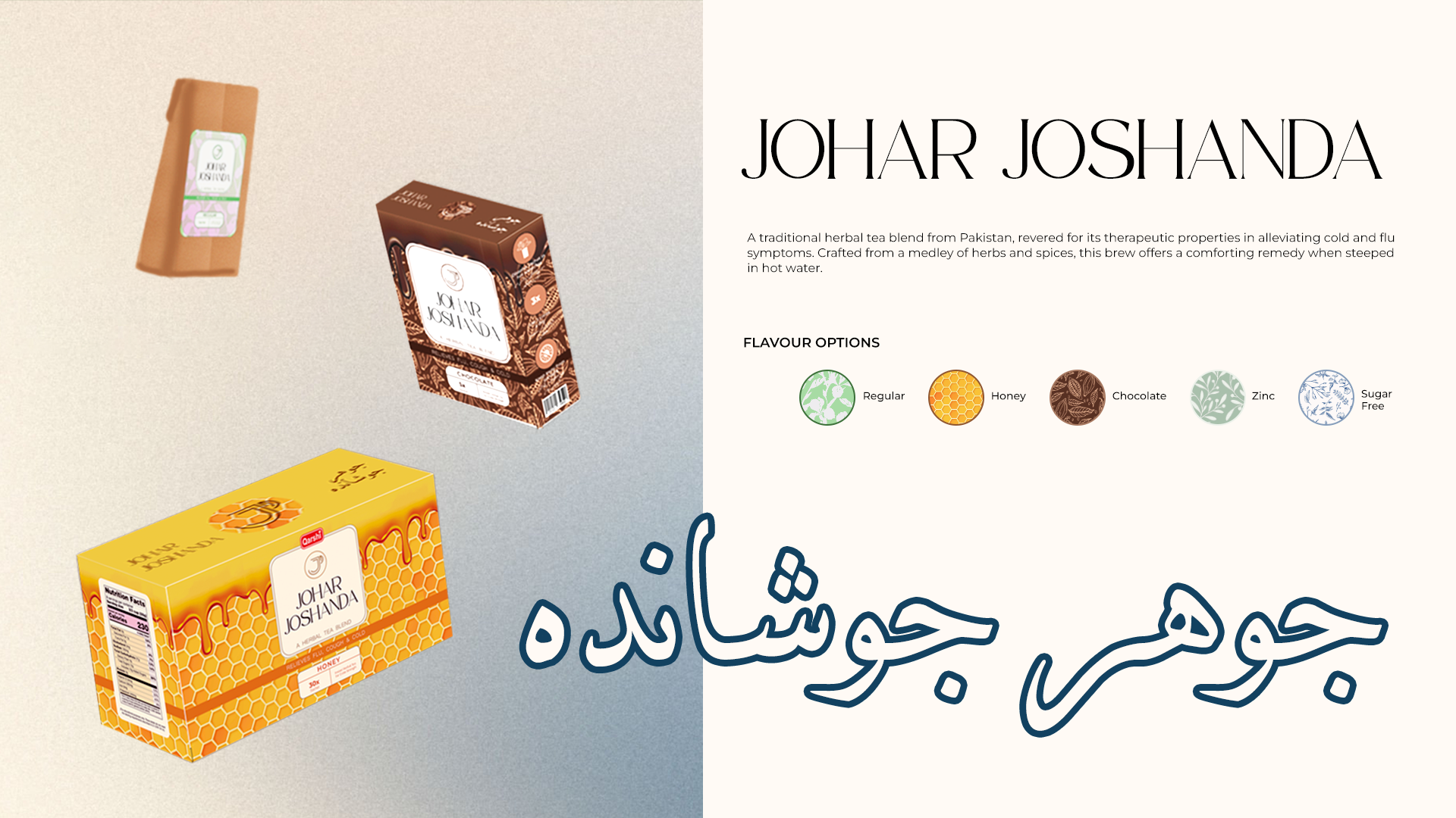
Introduction board: the rebranded boxes, the Urdu logotype and the five flavour options
Introduction board. Five flavours, Regular, Honey, Chocolate, Zinc, Sugar Free, each with its own pattern and colour, under one Latin and Urdu lockup.
04
Research

What the old pack was doing wrong

Five local brands and five global ones in the same category were pulled apart panel by panel, then Johar Joshanda’s own sachet, carton and box were compared against each other. Six findings came out of it, and each one turned into a design decision.

Purpose & goalsModernise without dropping the traditional cue, and lift how the product is perceived on shelf
Market researchCurrent category trends, international competitors and customer feedback compared side by side
Brand identityNo logo at all, no colour system, nothing coherent between variants
CommunicationRebrand while keeping customer affiliation, the name is already trusted
ValuesCaters to all ages; the product is bought for warmth and comfort, not just relief
SustainabilityPlastic sachets everywhere, the brief became an experiment in paper
Category auditTen packs, four criteria, filled means present and working
PackMarkColourHierarchyPaperJohar Joshanda As foundLocal herbal brands ×5Global tea brands ×5Johar Joshanda Rebranded
The existing range scored on none of the four. Global tea brands scored on all of them, that gap set the target.
03
Identity

A cup, a J, one alphabet in two scripts

The monogram folds a J into a cup with steam, readable at sachet size, and equally at home as an outline on a coloured field. Each flavour owns a colour and a hand-drawn botanical pattern, so the range reads as a family before a single word is read.
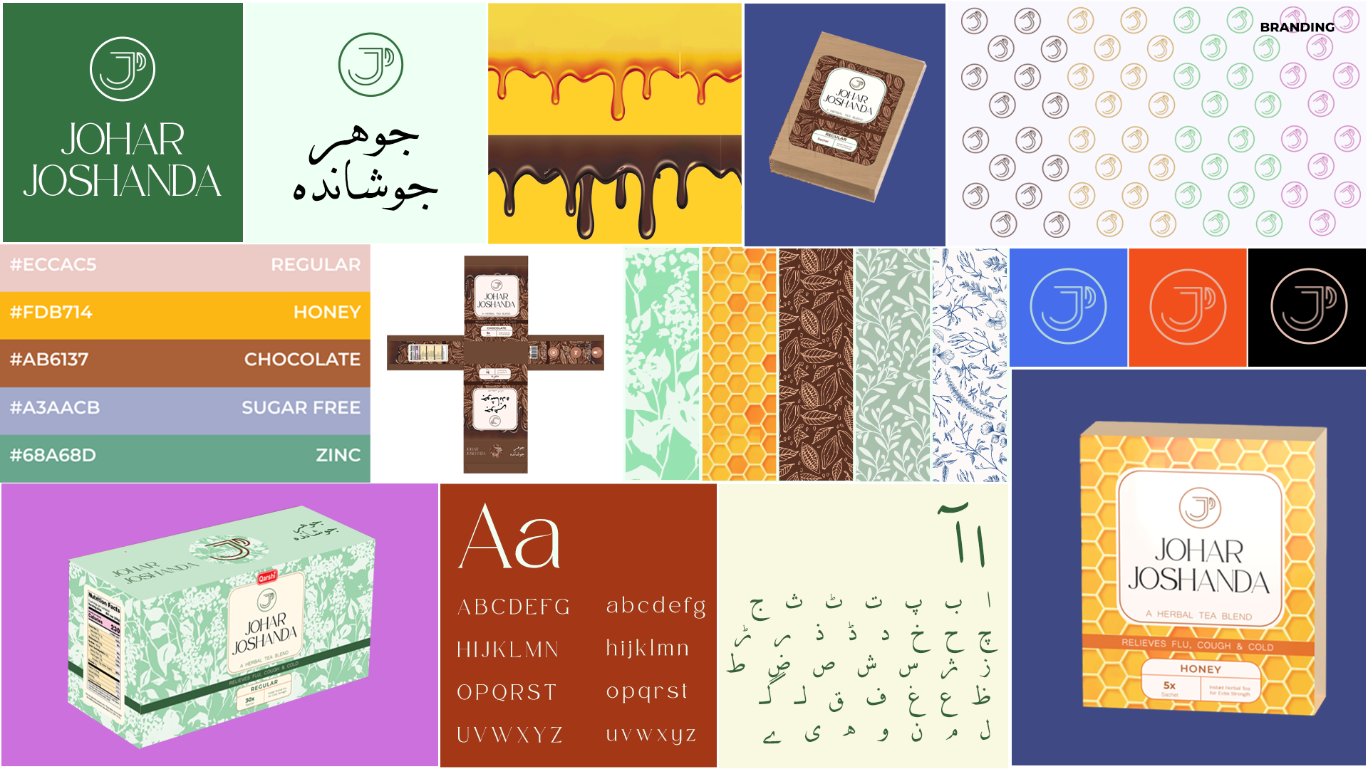
Regular#ECCAC5
Honey#FDB714
Chocolate#AB6137
Sugar Free#A3AACB
Zinc#68A68D
Brand board: monogram, Urdu logotype, colour palette, patterns, dieline, Latin and Urdu type
Brand board. Mark, Urdu logotype, the five-colour palette, flavour patterns, the flattened dieline, and a Latin serif paired with a Nastaliq-adjacent Urdu face.
03
Packaging

Paper, printed at actual scale

Three formats carry the system: a 30-sachet retail box, a 5-sachet carry pack, and the single sachet itself, all kraft paper, all printed with the flavour pattern and a cream label that repeats the mark.

The dieline was drawn, printed and folded at real scale so the label sat where a hand actually holds the box, and so the pattern still read once the panels wrapped around a corner.
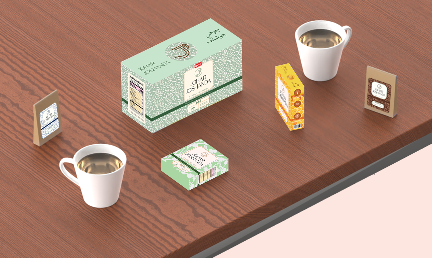
The full range staged on a table with two cups of brewed joshanda
Range shot. Retail box, carry packs and sachets, staged as the product is actually used, on a table, next to a brewed cup.
04
Poster

Five flavours, one sheet

The A3 launch poster runs all five patterns as diagonal bands, with a sachet resting on each, the fastest way to say “same tea, five flavours, new paper pack” without a paragraph of copy.
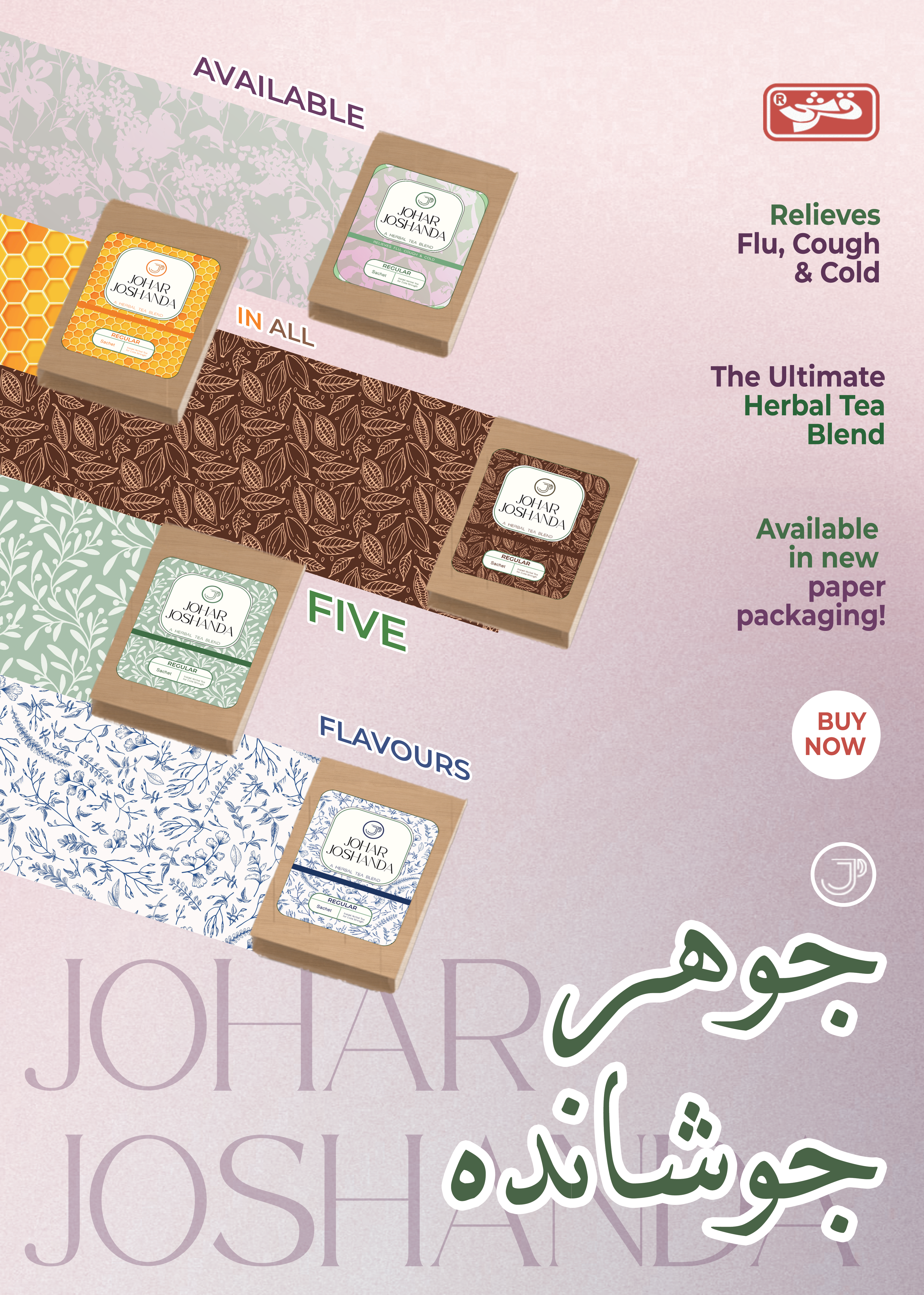
SubmittedFour-slide brand presentation, A3 rebranding poster, and a finished cardboard prototype printed at actual scale.
A3 launch poster: five patterned bands, a sachet on each, Urdu and Latin logotypes
A3 poster. “Available in all five flavours”, relieves flu, cough and cold, now in paper packaging.
06
Prototype

Printed, cut and folded

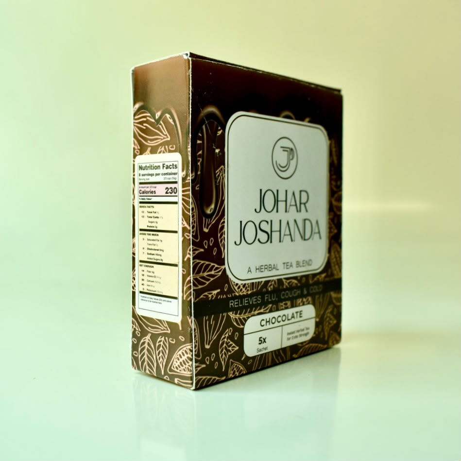
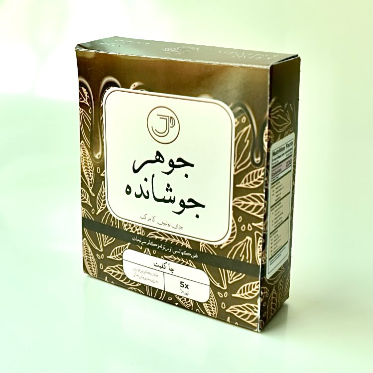
Every format was printed at actual scale and built by hand, the 30-sachet Honey box, the 5-sachet Chocolate pack with a fully Urdu front, and the kraft single sachet with its sticker label. Nutrition panel, directions, barcode and dosage icons all sit where a real pack would carry them.
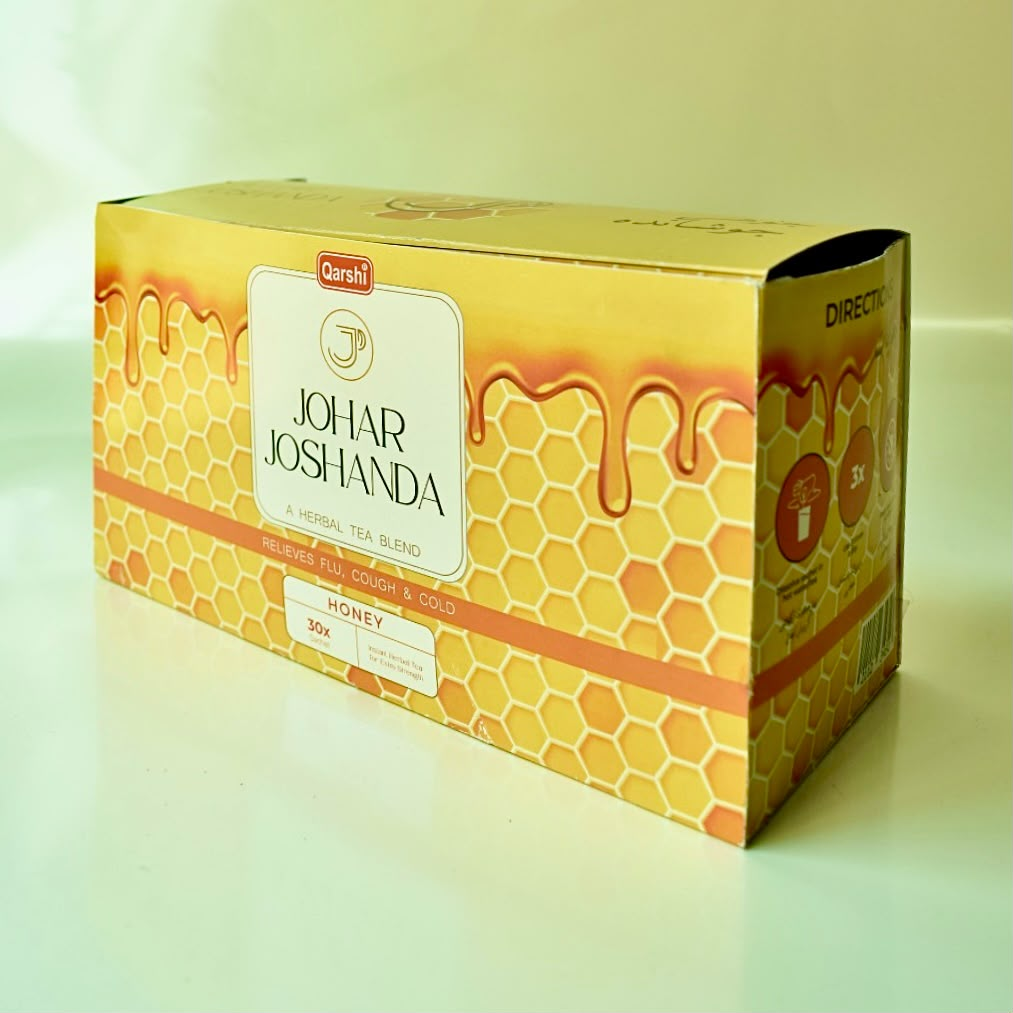
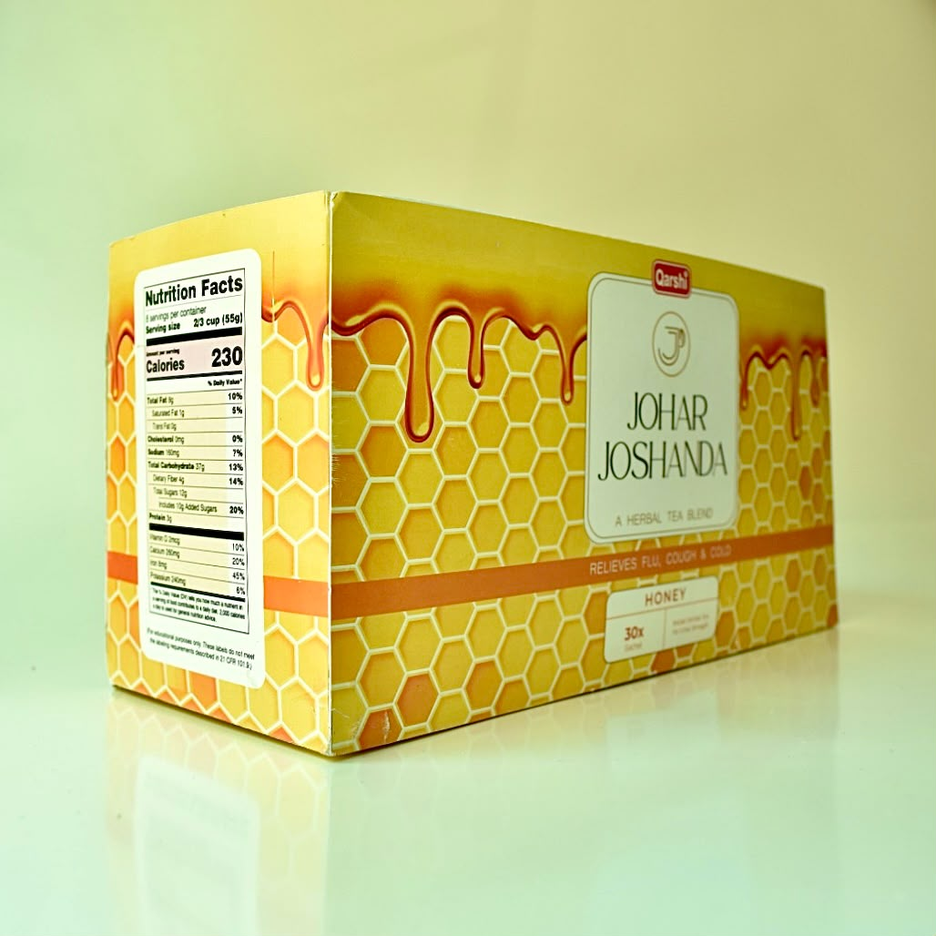
The finished Honey box, printed and folded
Honey, 30-sachet box, honeycomb with a dripping-honey band.
Honey box side panel with nutrition facts
Nutrition facts printed on the pattern, not on a white block.
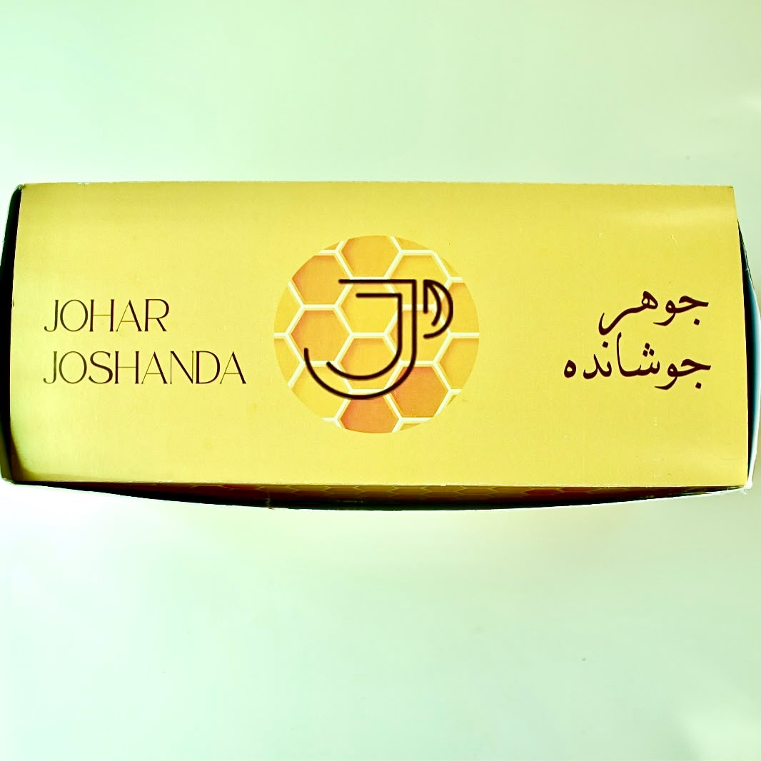
Top of the Honey box with monogram and bilingual logotype
Top face, Latin left, monogram centre, Urdu right.
Chocolate 5-sachet pack, English front
Chocolate, 5-sachet carry pack in cacao-leaf line art.
Chocolate pack with the fully Urdu front
The same pack in Urdu, the whole label localises.
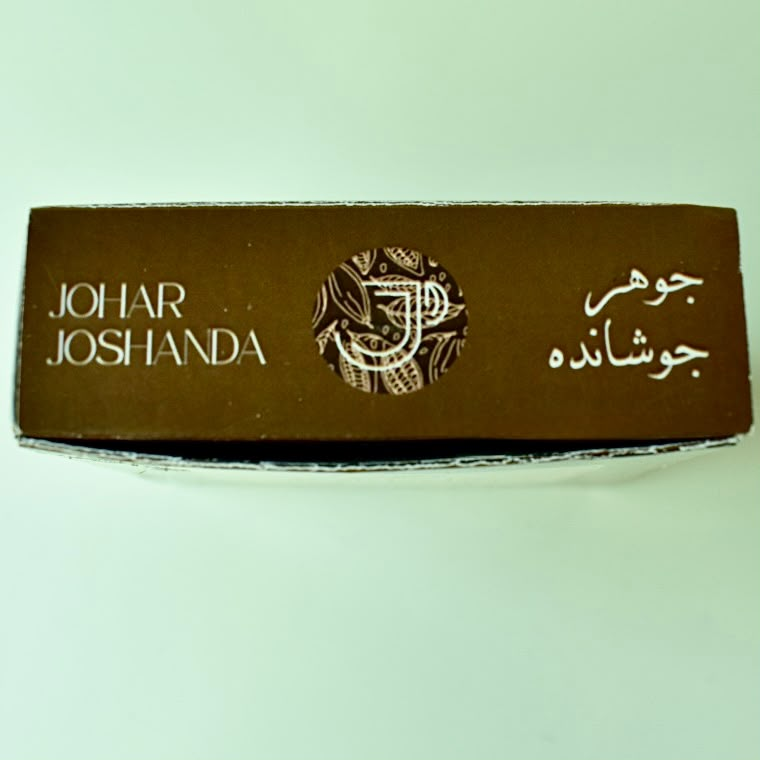
Top of the Chocolate pack
Monogram reversed out of the pattern.
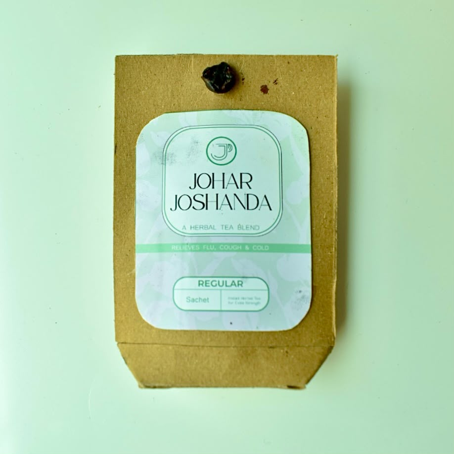
Kraft single sachet, Regular
Kraft single sachet, sealed with a clay dot.
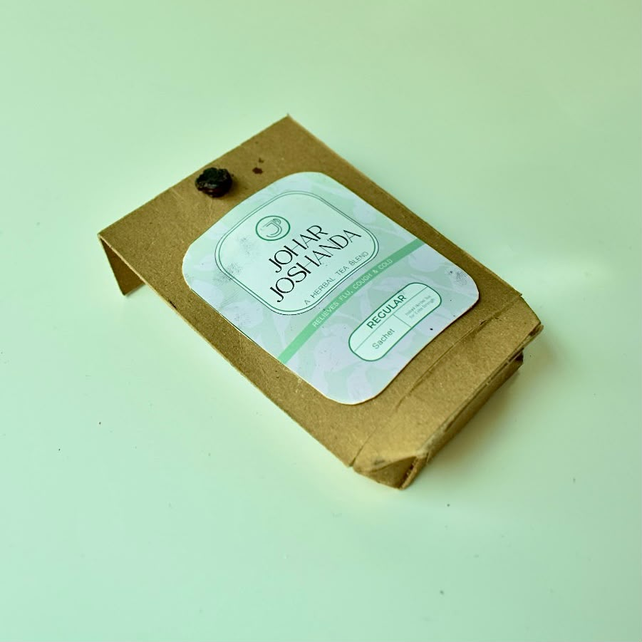
Kraft sachet at an angle
Label wraps the fold so it reads from any side.
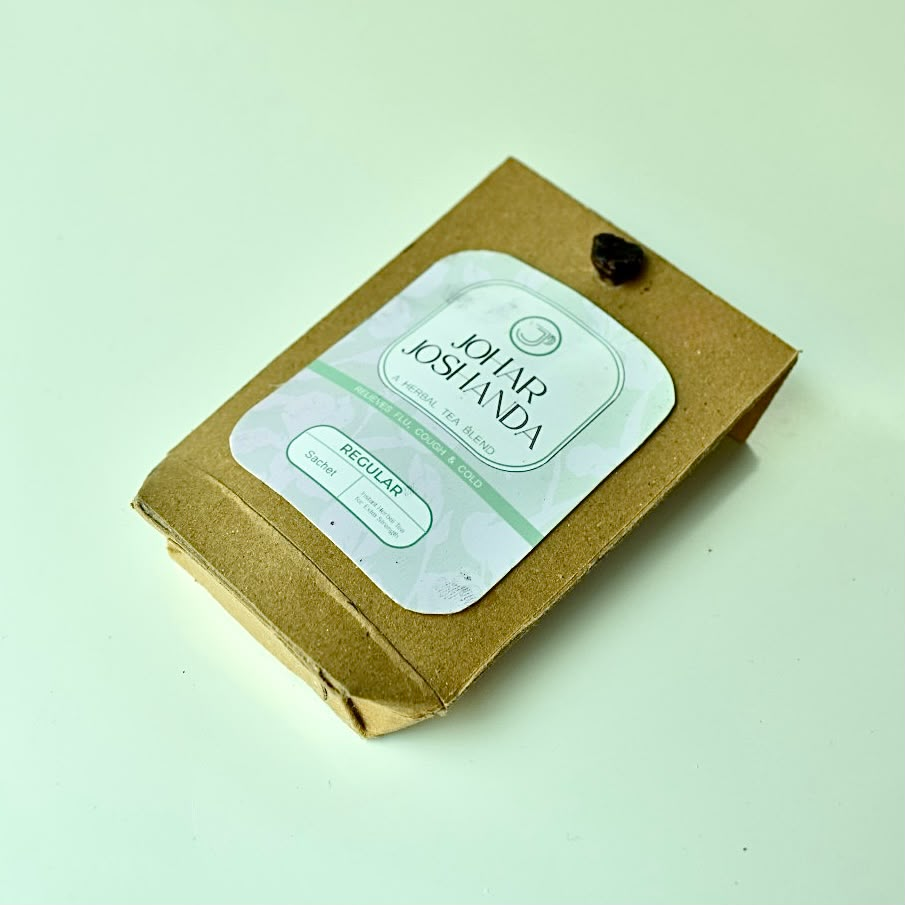
Kraft sachet lying flat
Regular, botanicals printed pale so paper still reads as paper.
View CoralithBack to Projects