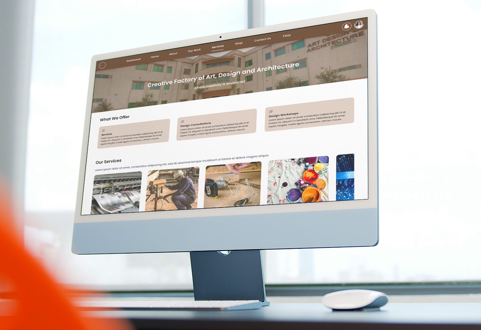
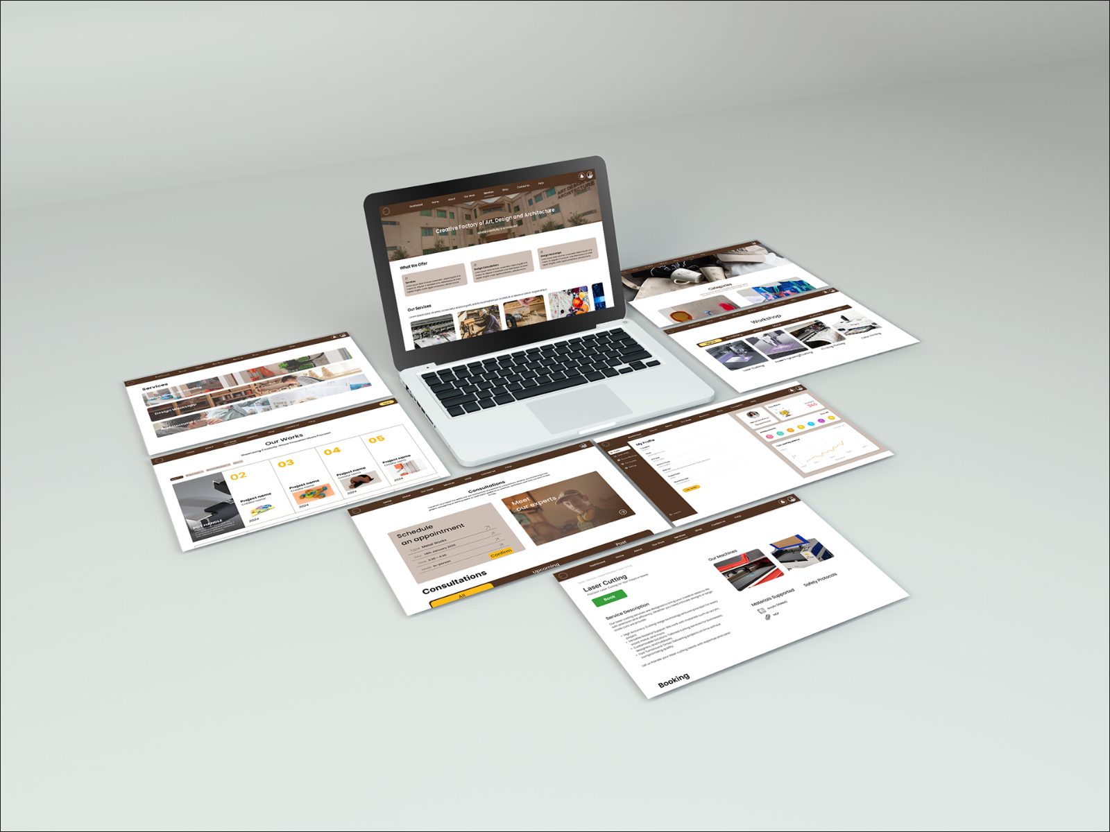
CFADA is the fabrication facility inside NUST’s School of Art, Design and Architecture: laser cutters, CNC routers, 3D printers, and metal, wood, paint, jewellery and textile workshops. It makes most of the physical work the school is known for.
It had no digital front. Availability lived in technicians’ heads and prices were quoted out loud, so anyone not already embedded in the building had no way in. My job: one place to find and book the whole facility.
Every failure people described came back to one thing: the facility had no public surface. Three design pressures came out of that.
One account type had to serve all three, so onboarding asks a single question: are you a SADA student?
The information architecture and user flows came before any screen. One rule: no task more than three steps from home, and no branch dead-ends. The mega menu exposes all seven workshops at once, so the depth is visible without being walked.
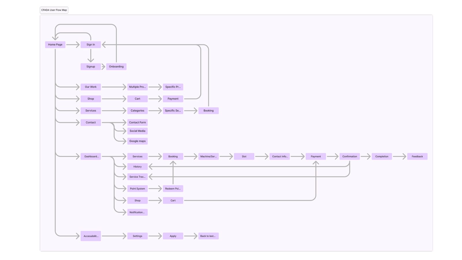 User flows, signed-out browsing on the left, the dashboard loop on the right
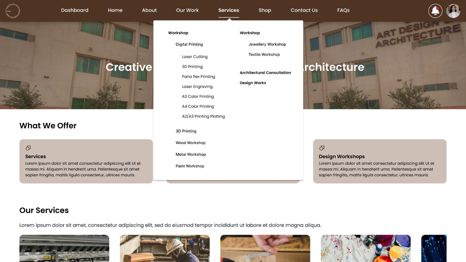 The mega menu flattens the hierarchy into one view
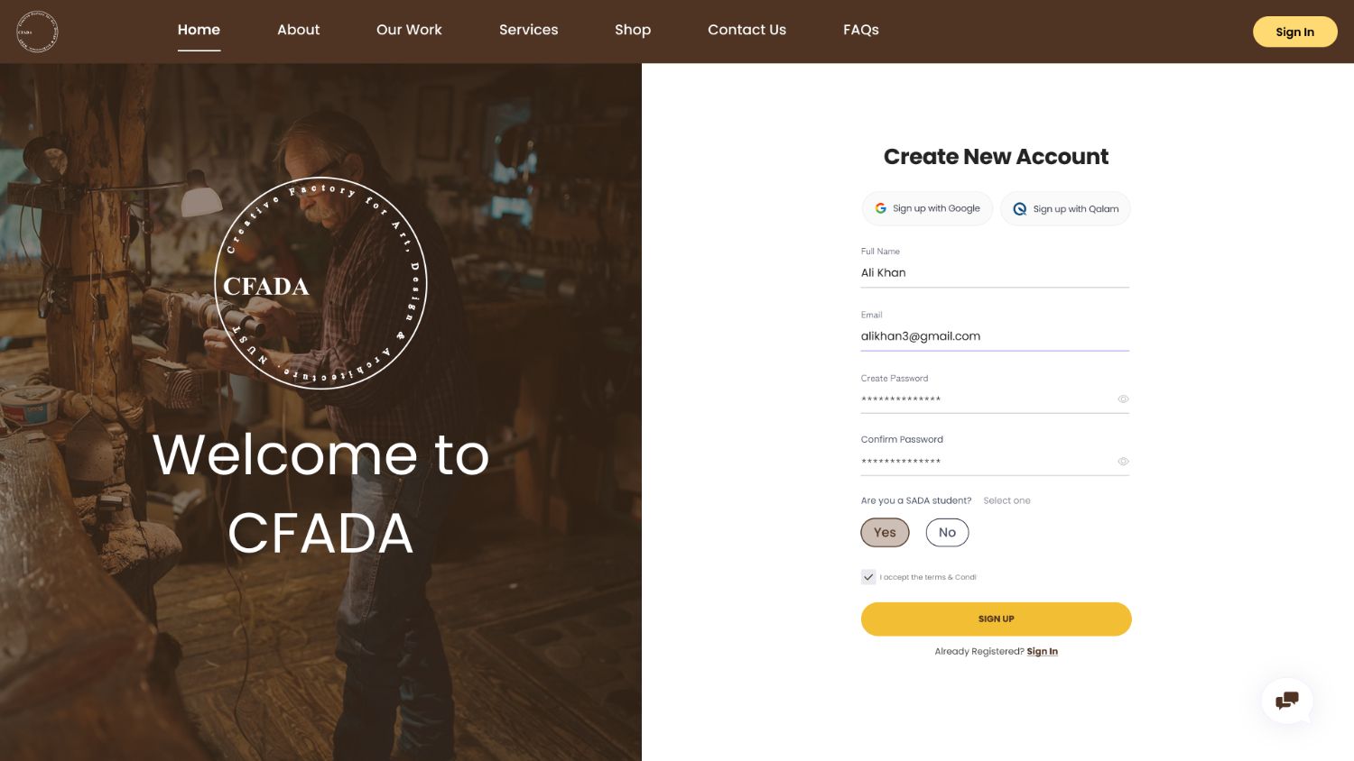 One onboarding question decides pricing, points and access
Workshop → category → machine, and every machine page is the same four blocks in the same order. Only the contents change, so learnability carries across all forty screens.
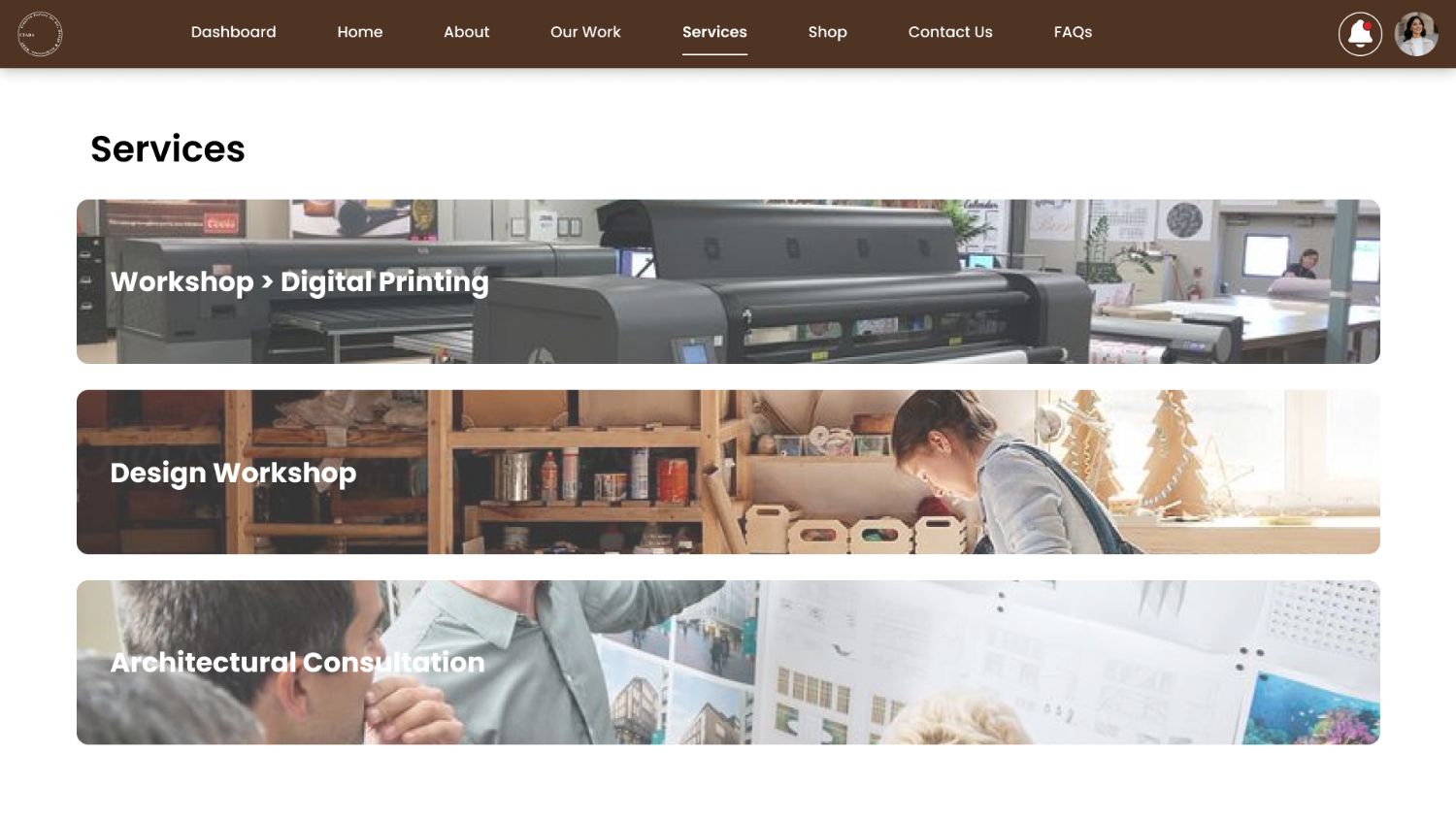
Workshop, design consultation or the shop, sorted by what someone already knows they want. No department names, no wrong door.
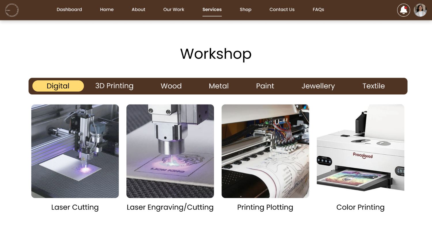 Digital, machines as a tabbed grid
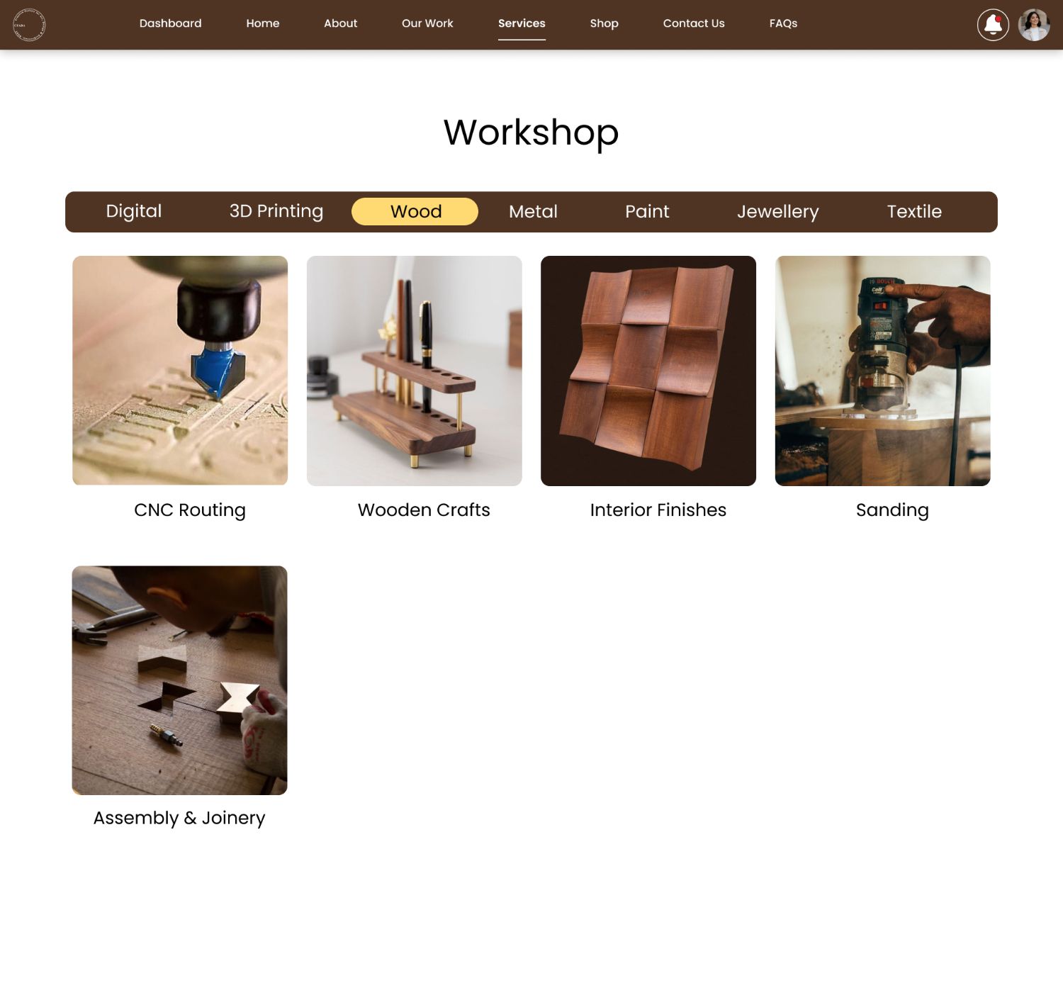 Wood, same grid, different machines
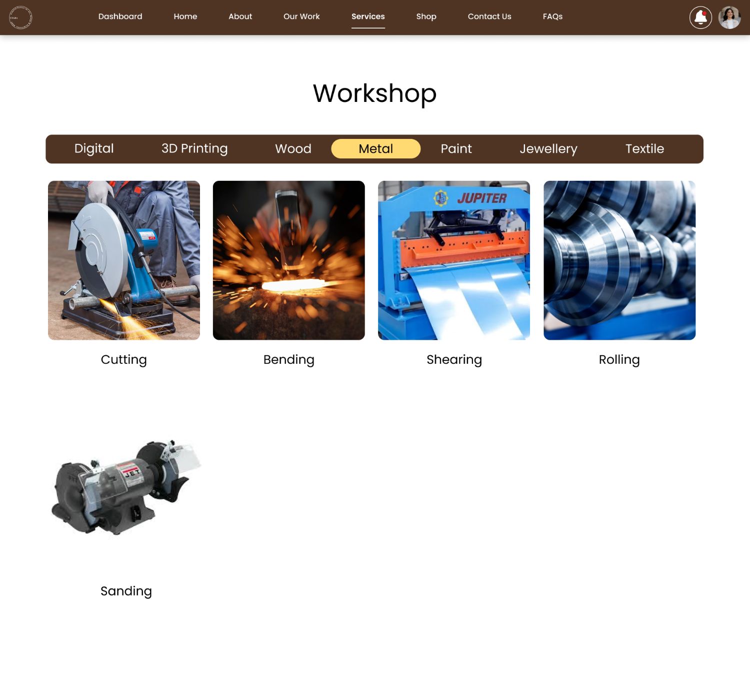 Metal, the tab bar never changes position
The core task flow. Material and dimensions produce a live estimate on the same screen, the file uploads beside it, and slots appear only after a date, progressive disclosure instead of a wall of options. It ends in a quote, not a charge, because pricing is still confirmed by a human.
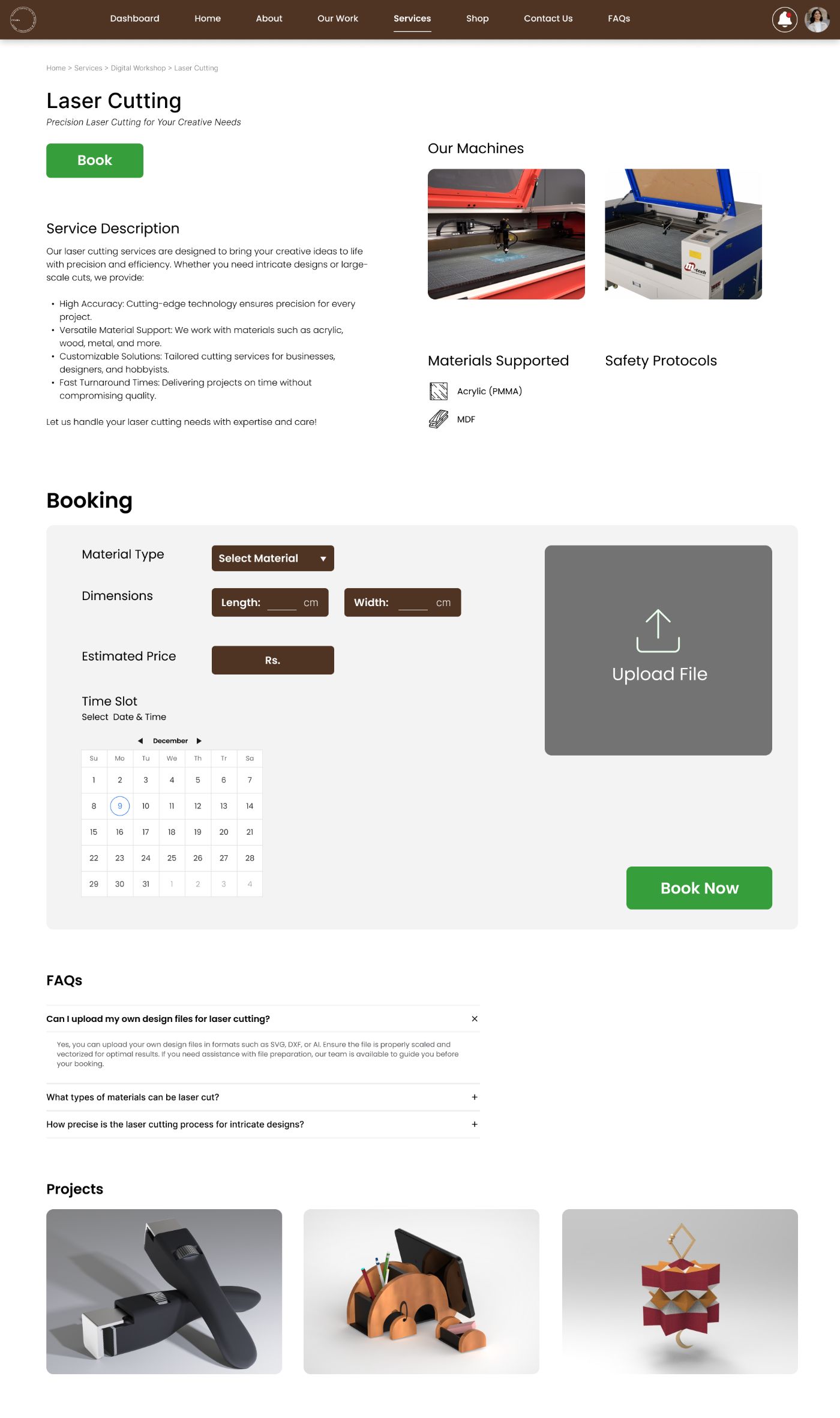 The service page in full: description, machines, booking, FAQs, projects
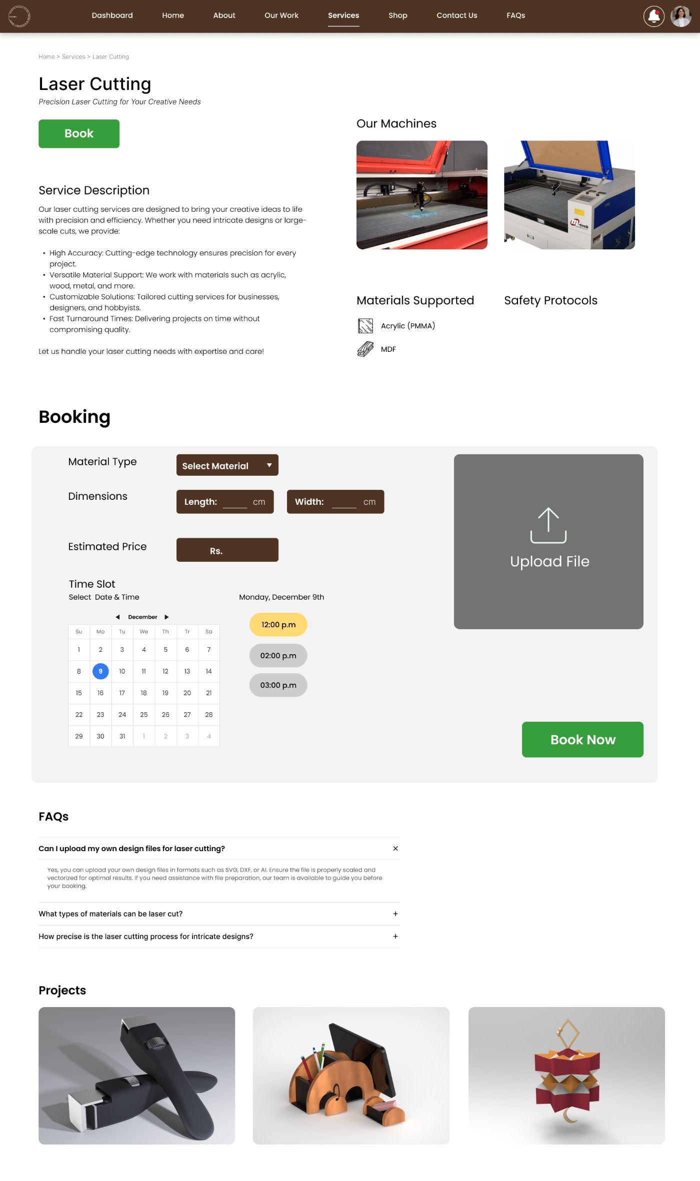 Slots appear only after a date, three real options
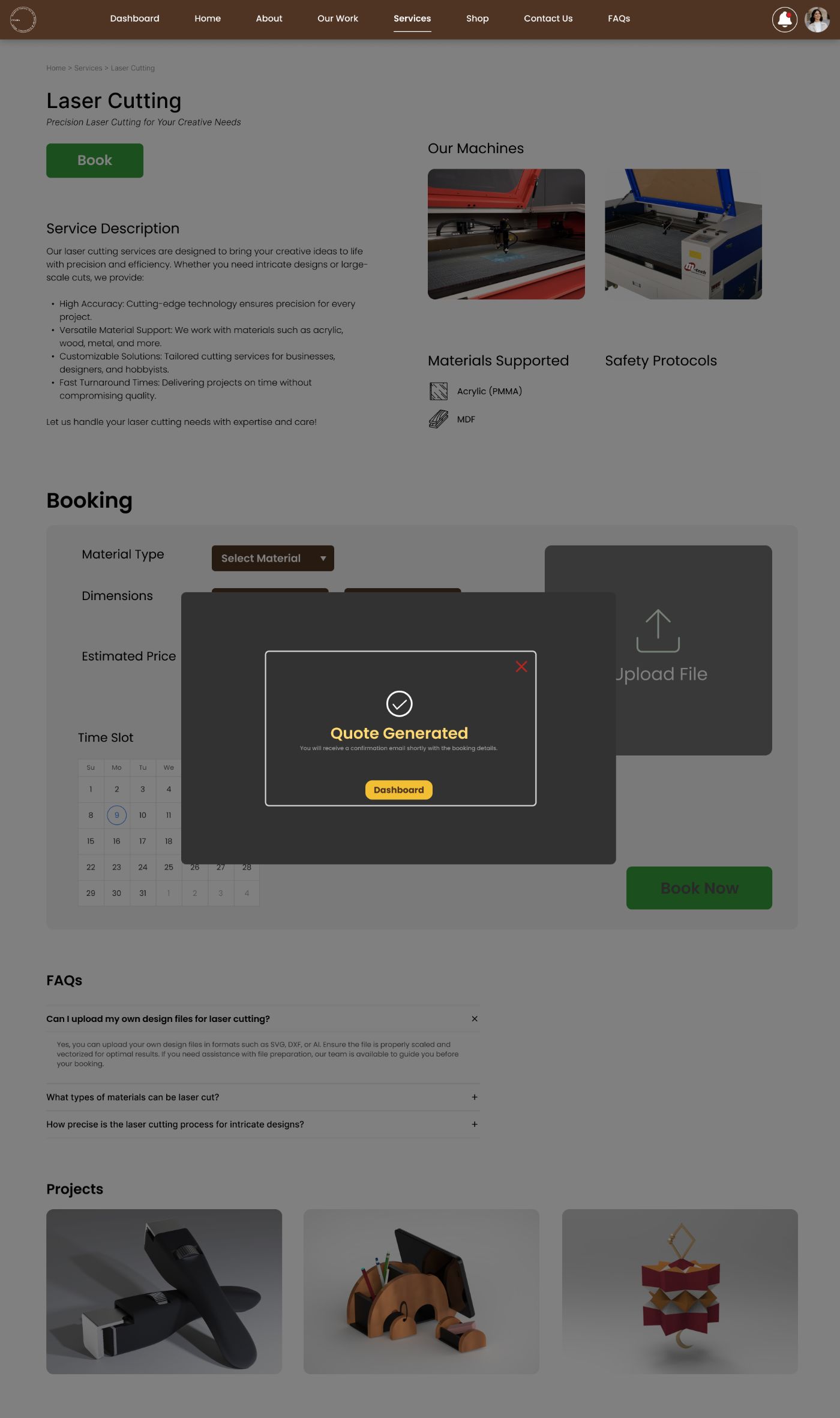 Ends in a quote, with a route to the dashboard to track it
Some jobs can’t be specified in a form, so consultations get their own flow: discipline, day, time, in person or not. Past bookings sit underneath, because that is the next thing users look for.
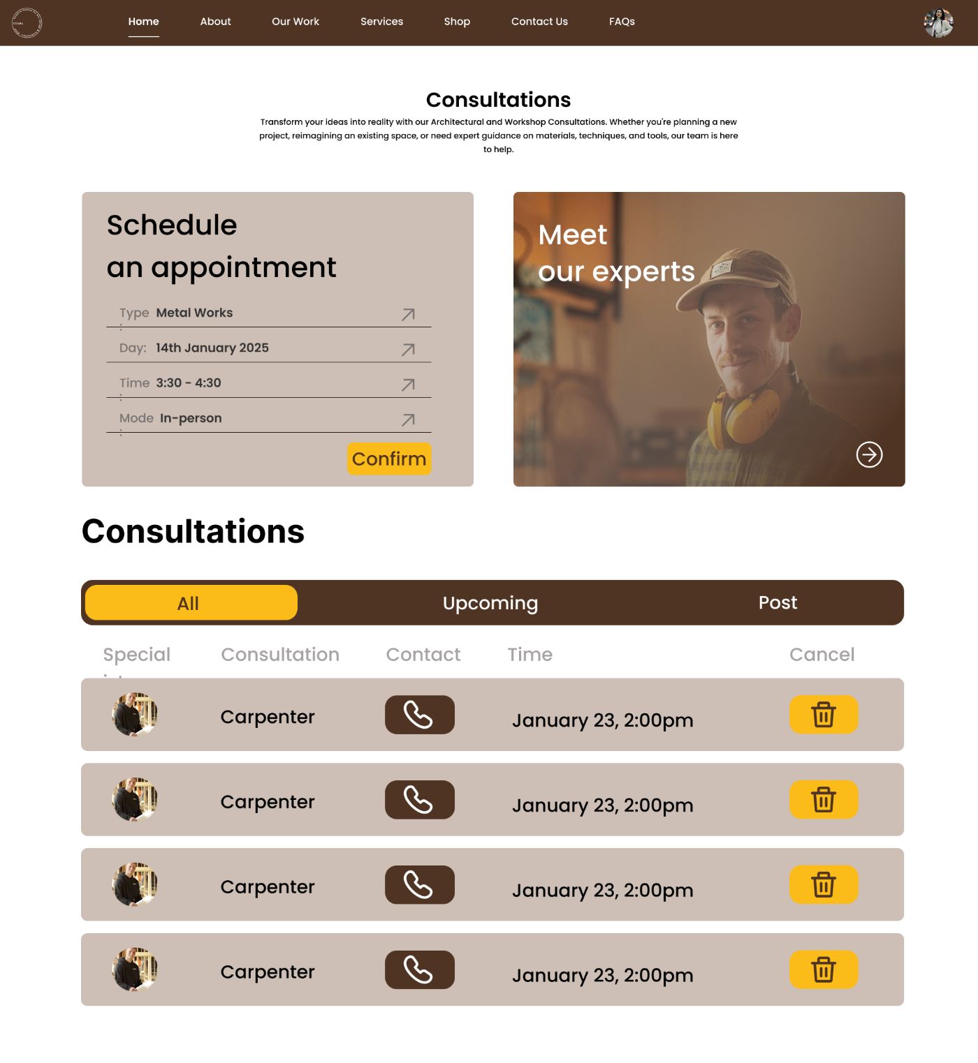 Schedule left, experts right, history below
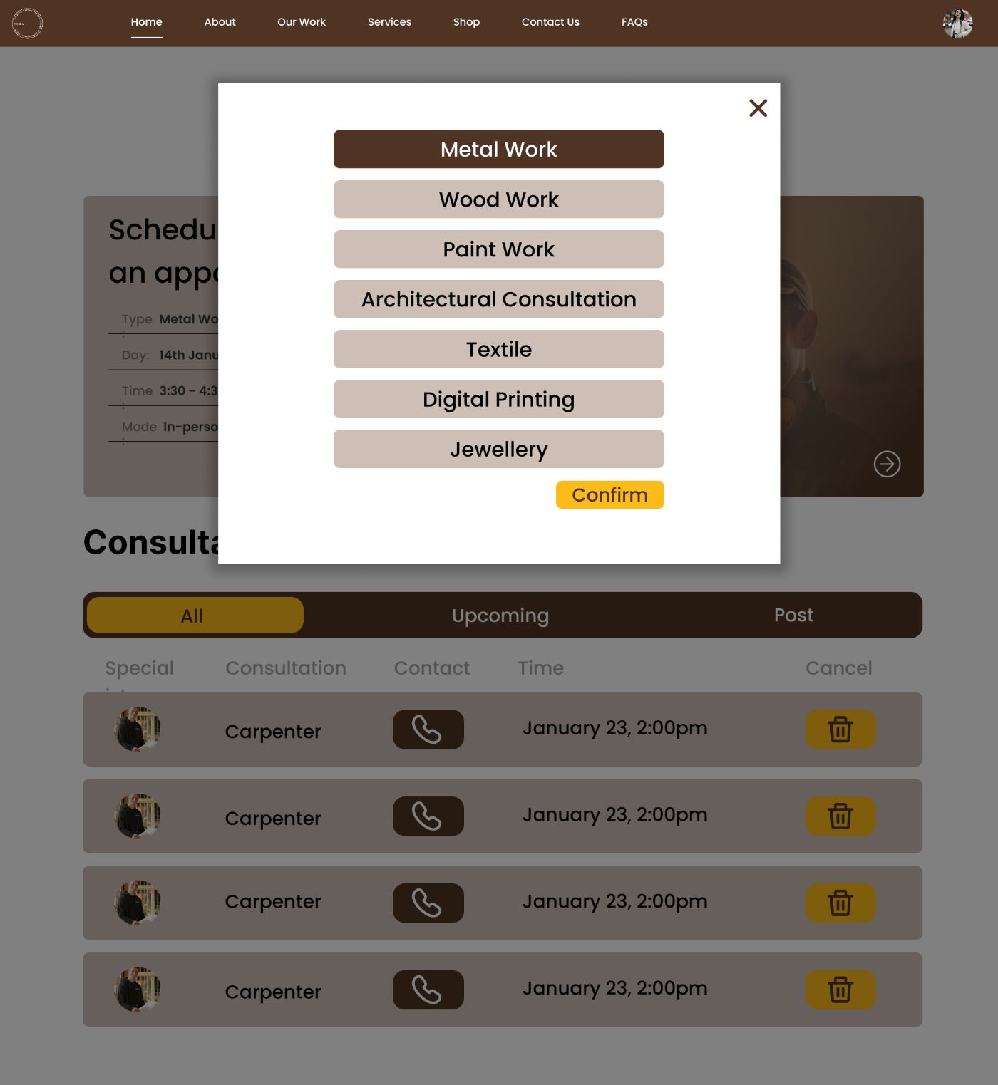 Each field opens as a modal, one decision at a time
The shop sells what the workshops make. Checkout is a fixed three-step bar, cart, delivery, payment, always visible, and every step reversible without losing entered data.
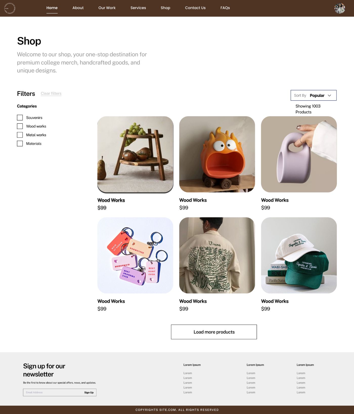
What the workshops make, for sale. The same card grid as the service catalogue, so buying takes nothing new to learn.
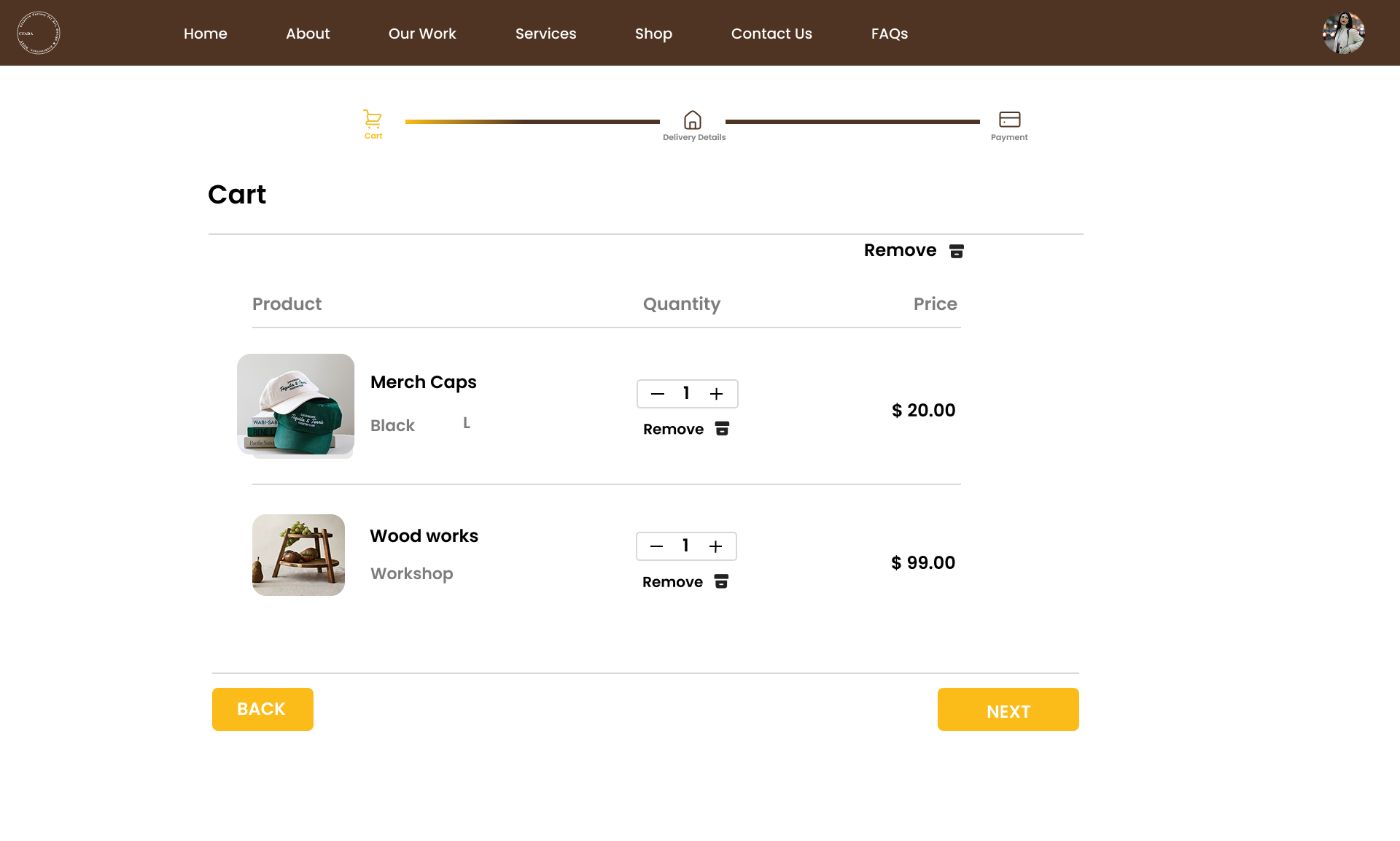 Step one, quantities and removals, nothing else
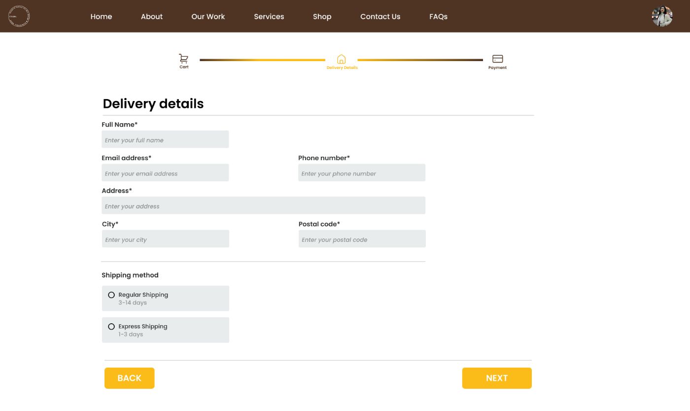 Step two, address and shipping speed
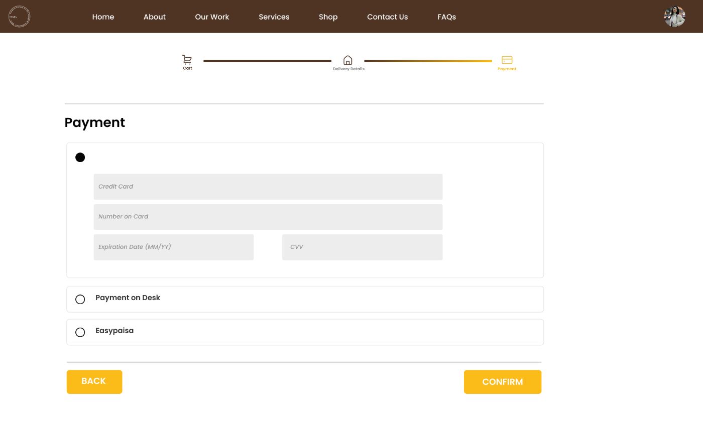 Step three, card, on-desk or Easypaisa, localised for the audience
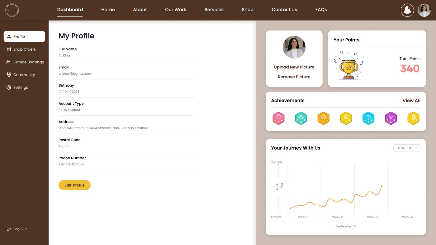
The answer to the third pressure. Orders, bookings and status live in one rail, with points and a community view, the retention layer over a one-off transaction.
Achievements and a record of activity sit next to the queue, so the dashboard reads as something worth coming back to, not a receipts folder.
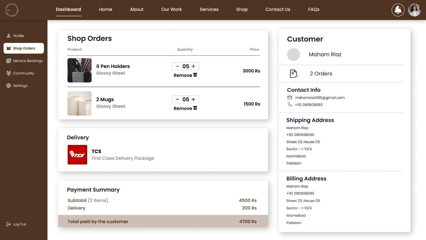 Orders, items, delivery and what was actually paid
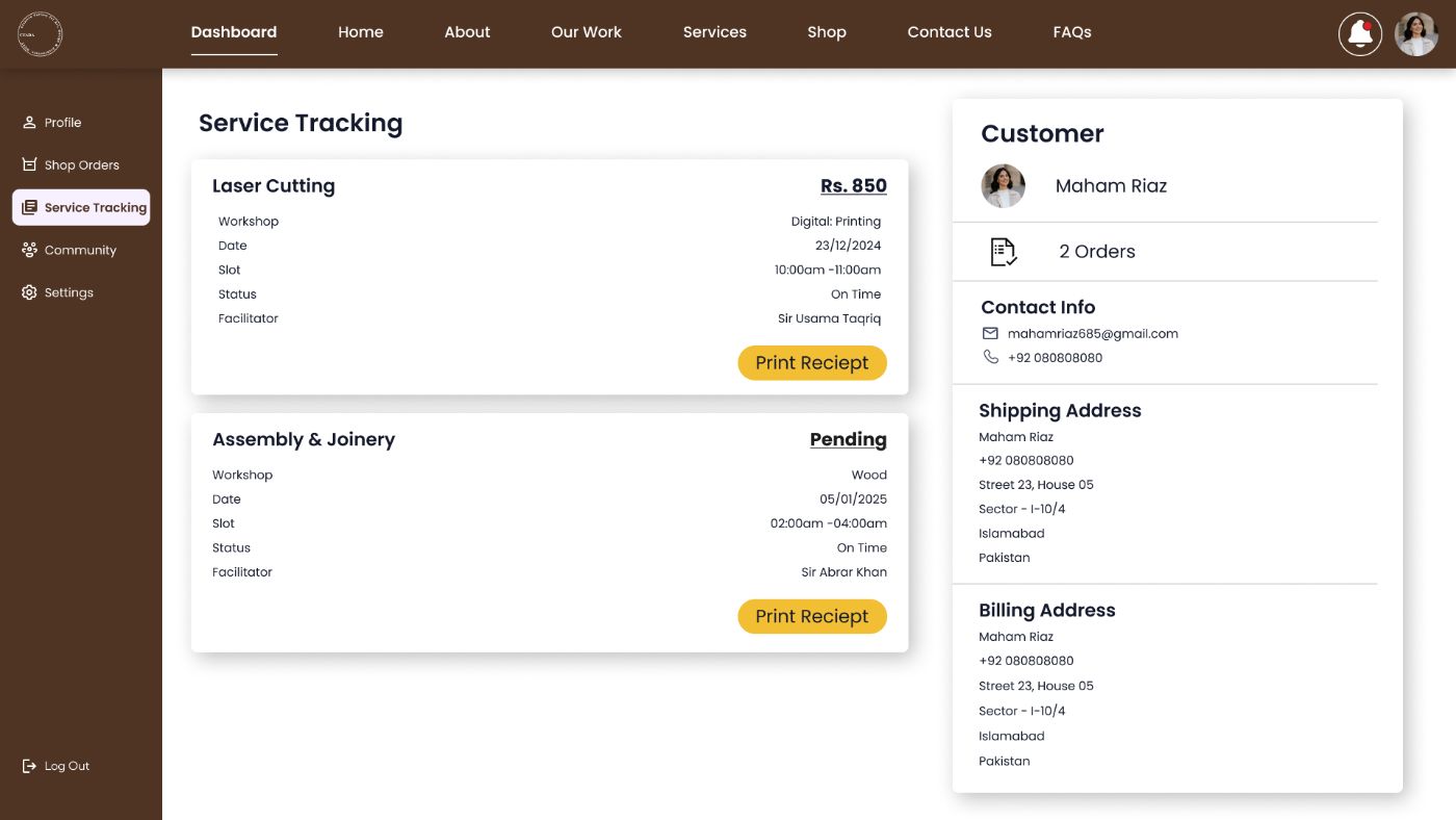 Tracking, each booking with its slot, status and facilitator
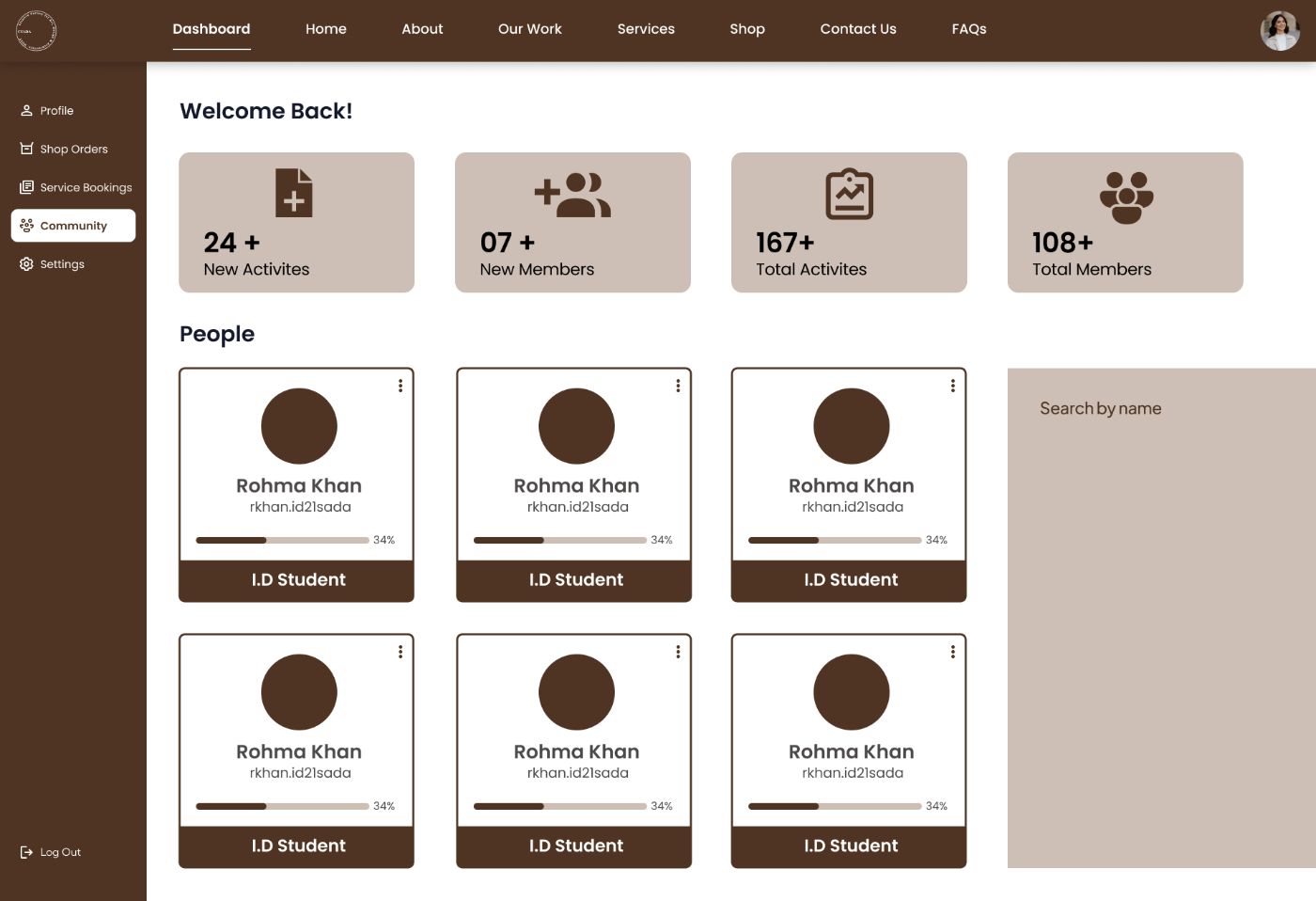 Community, the people using the same workshops
A floating accessibility panel on every page: theme, six steps of text size, six of contrast, cursor highlighting, screen-reader optimisation, one reset. Deliberately visible rather than buried in settings, the people who need it shouldn’t have to hunt.
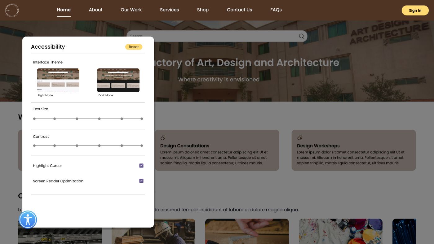 Every control on one card, over the home page
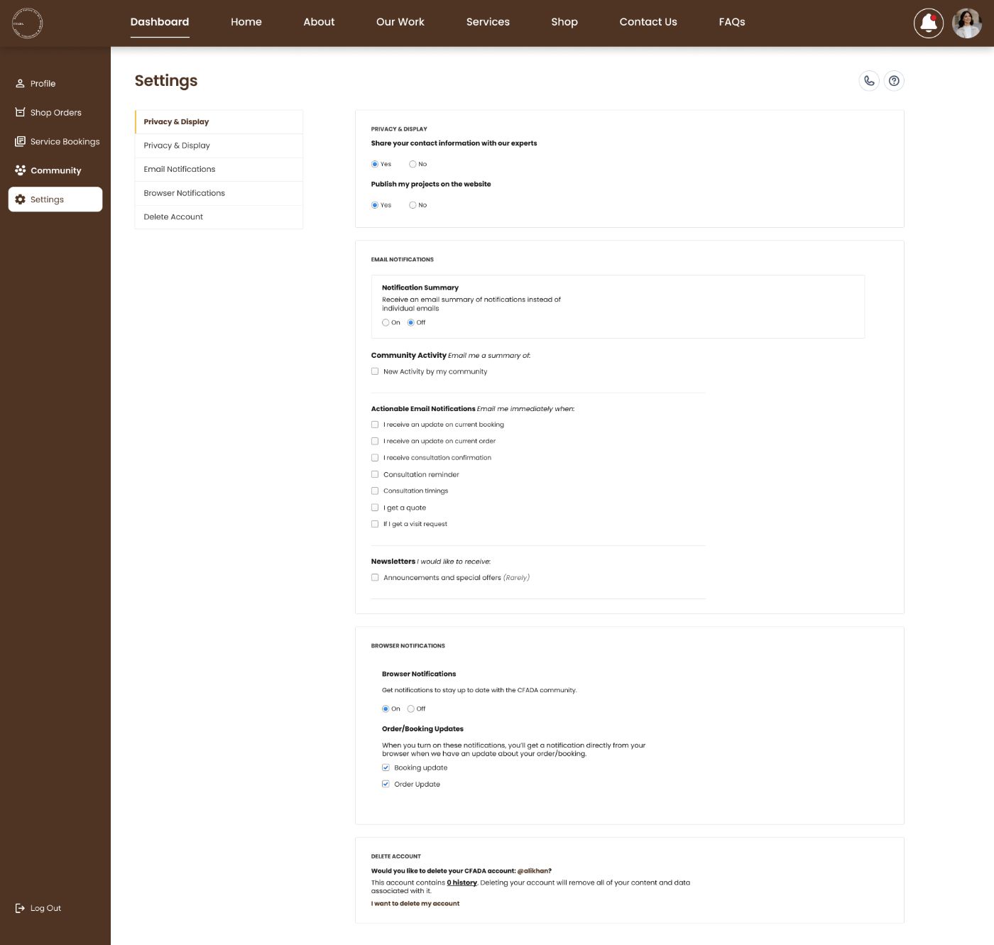 Settings, written in plain sentences
The palette comes from the building: stained wood, kraft, brass. Brown carries structure, yellow marks the action that moves a task forward, green appears once, on Book Now. Everything else is white so the work carries the colour.
The single service template made forty screens possible. Adding a workshop costs a tab and some machine cards.
What is missing: the facilitator side. The system creates work for technicians, and none of their screens exist yet.
Next, in usability testing: whether the estimate is trusted. Read as a price or as a guess, it decides whether the booking flow works.
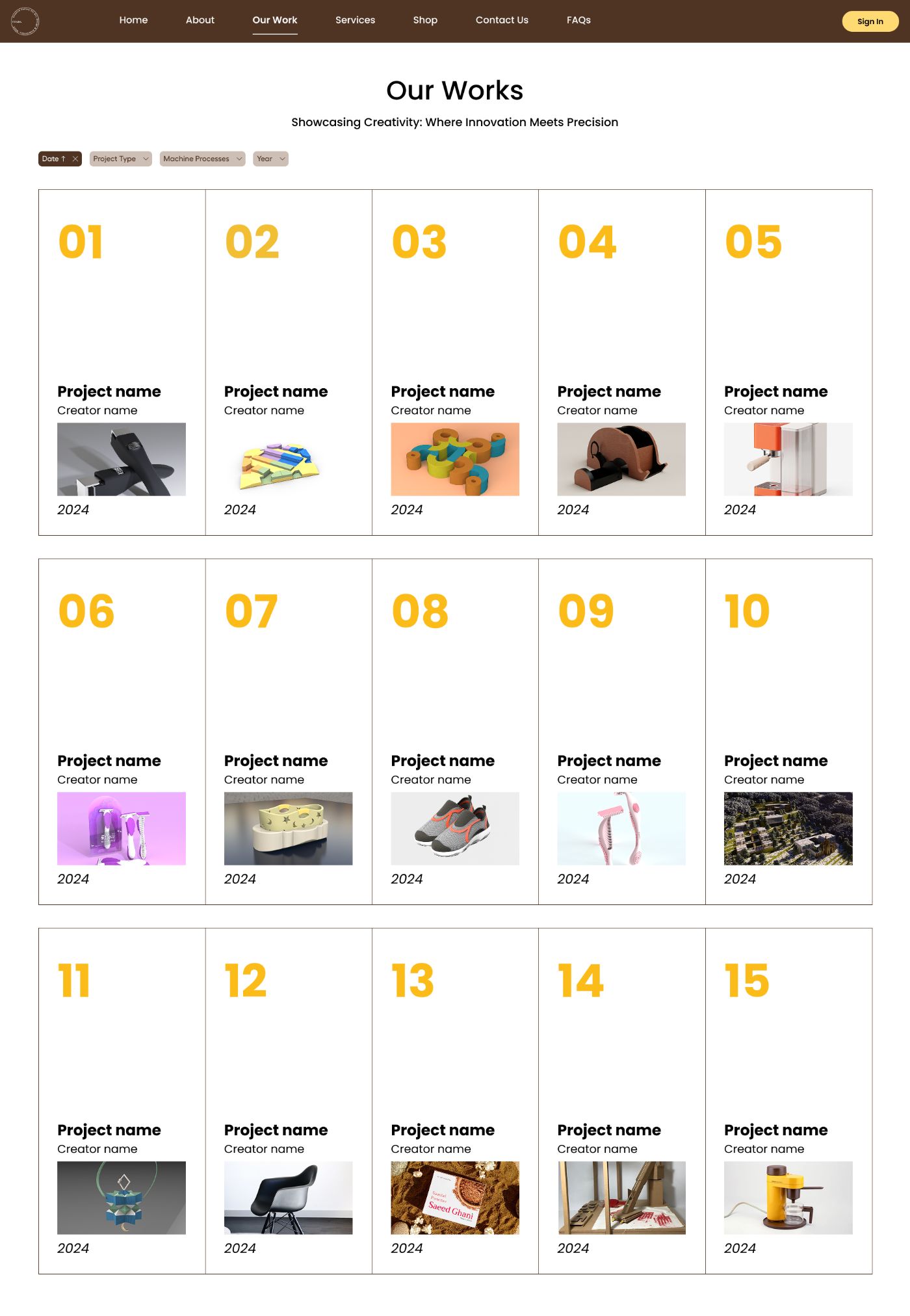 Our Works, the school’s output, filterable by process and year
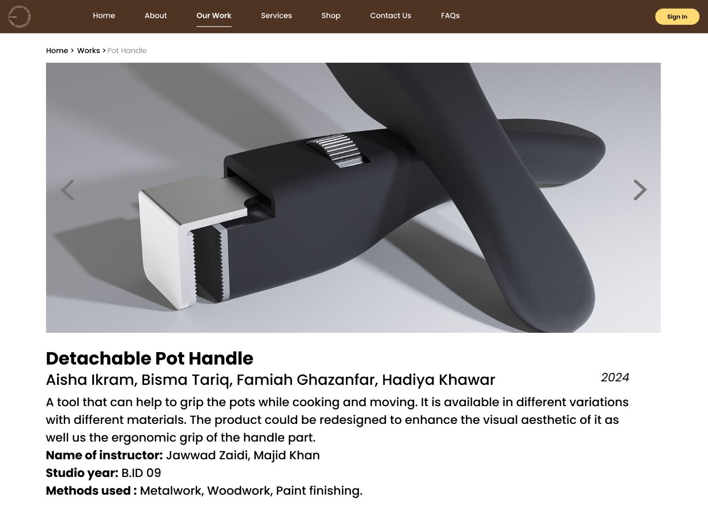 A project, credits, studio year and the methods used to make it