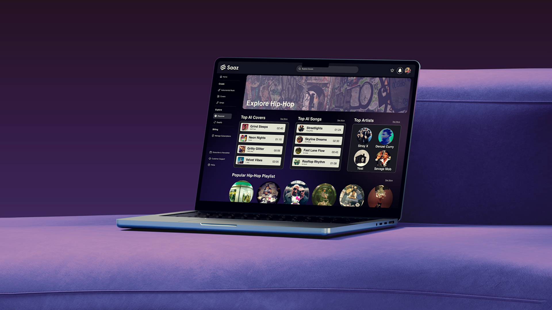
The mobile beta did one thing: a prompt box and a play button. The web brief was a dashboard carrying four generative tools, a library, a social layer and a paid tier, for users ranging from “never opened a DAW” to “I need the seed value”.
I designed it with Aisha Ikram, Bisma Tariq and Famiah Ghazanfar. Five weeks, ideation to clickable prototype, so we committed early to one repeatable page pattern and spent the rest of the time defending it.
The market sat at two extremes: a bare prompt box, or a browser DAW. One loses the producer in ten minutes, the other loses everyone else in ten seconds. Three design pressures came out of that.
That constraint, not the visual language, is what every decision after this point answers to.
Ideation first, then an information architecture that cut every page not serving one of the three user groups. The site map and user flows that survived hold one rule: no tool is more than one click from any other, so a user who picks the wrong generator never has to backtrack.
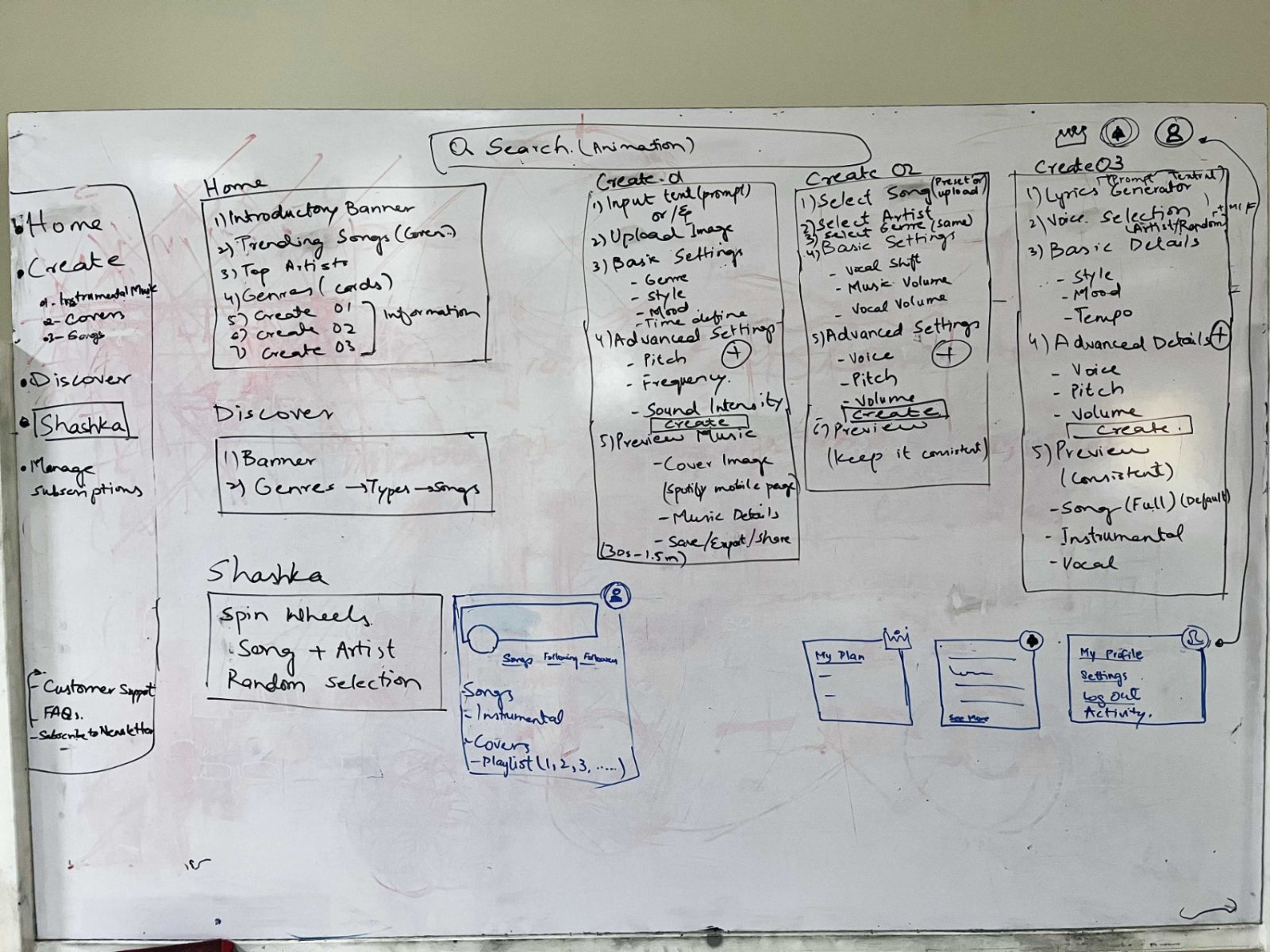 Ideation, everything the product could be before the cutting started
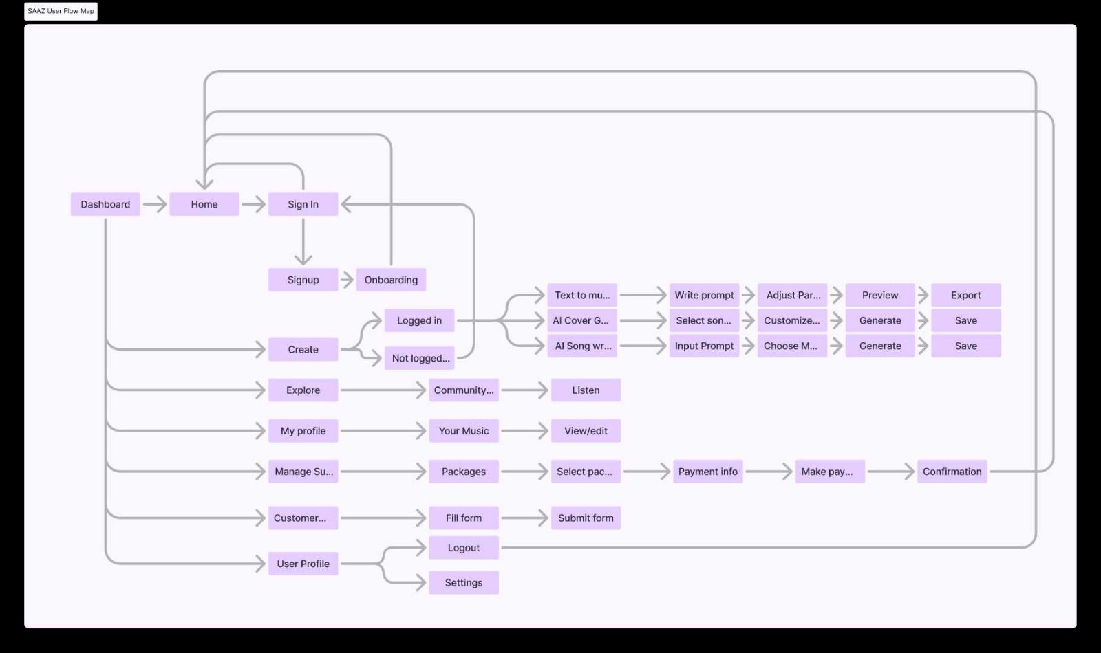 Site map and user flows, every tool one click from every other
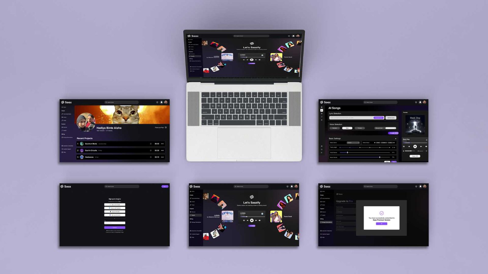
Laid out side by side, the four tool pages still read as four different products. That is where the shared anatomy came from.
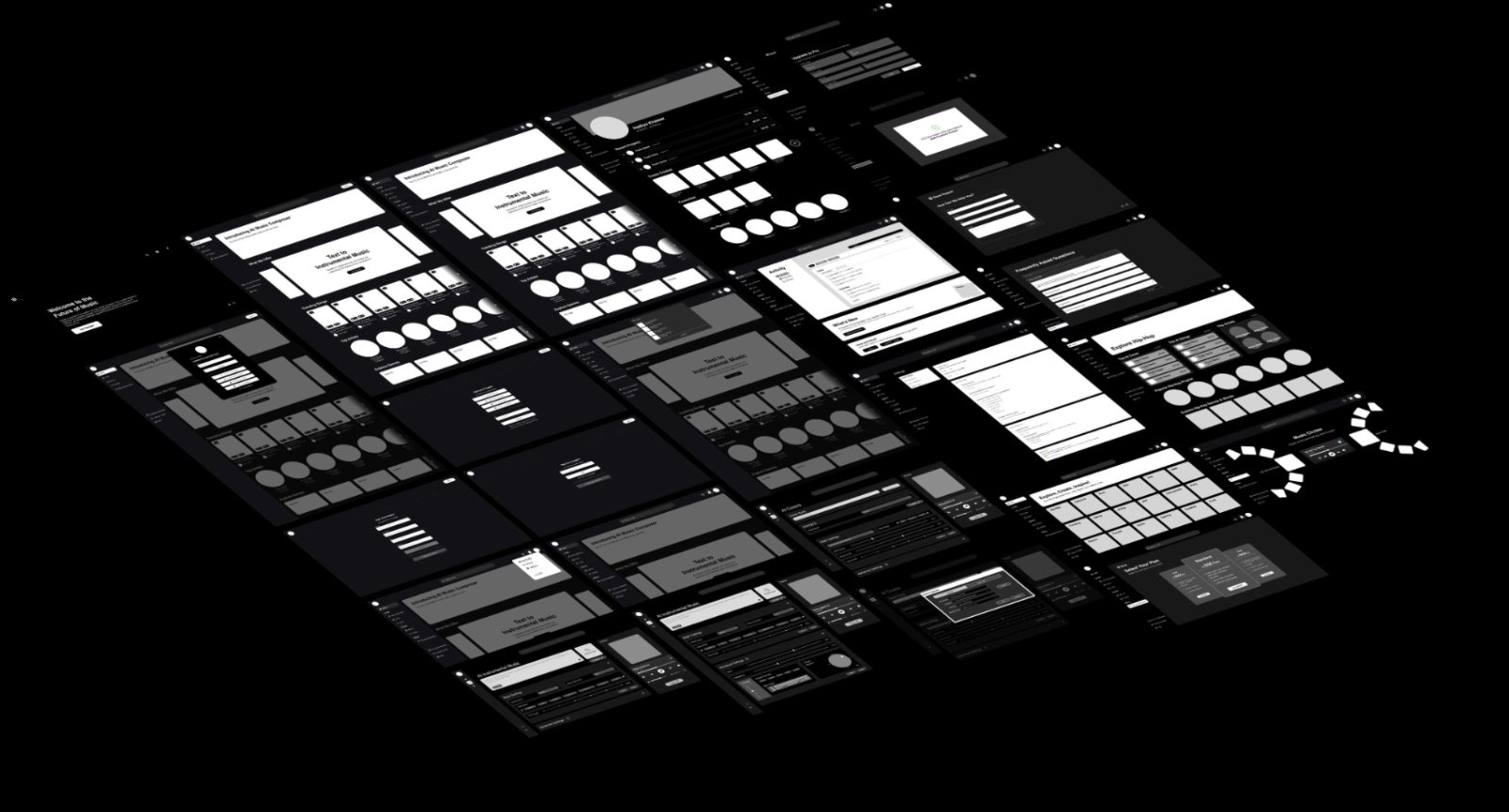 All 22 screens in greyscale, structure before brand colour
Every generator reuses the same four-part page anatomy in the same positions; only the controls change. That consistency is what makes the product learnable, learn one tool page and you know all four.
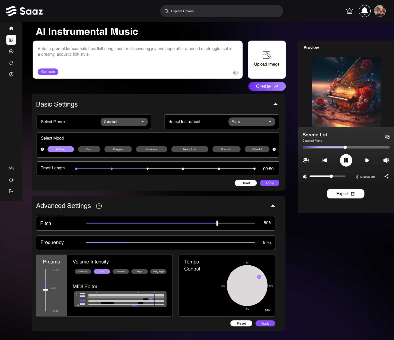 AI Instrumental, the anatomy in its plainest form
Progressive disclosure answers the second pressure; the craft is where the line sits. Anything judged by ear stays on the surface, anything needing vocabulary goes in the drawer. Nothing is removed.
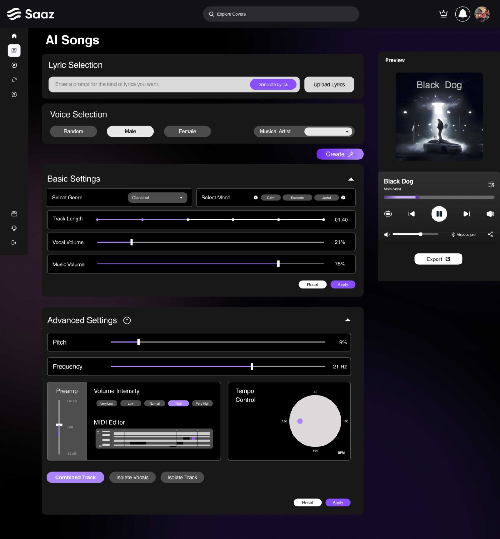
Four choices, all judged by ear. Nothing has to be learned first.
The only modal in the product. Format, quality and stems have consequences outside Saaz, so they get a deliberate stop.
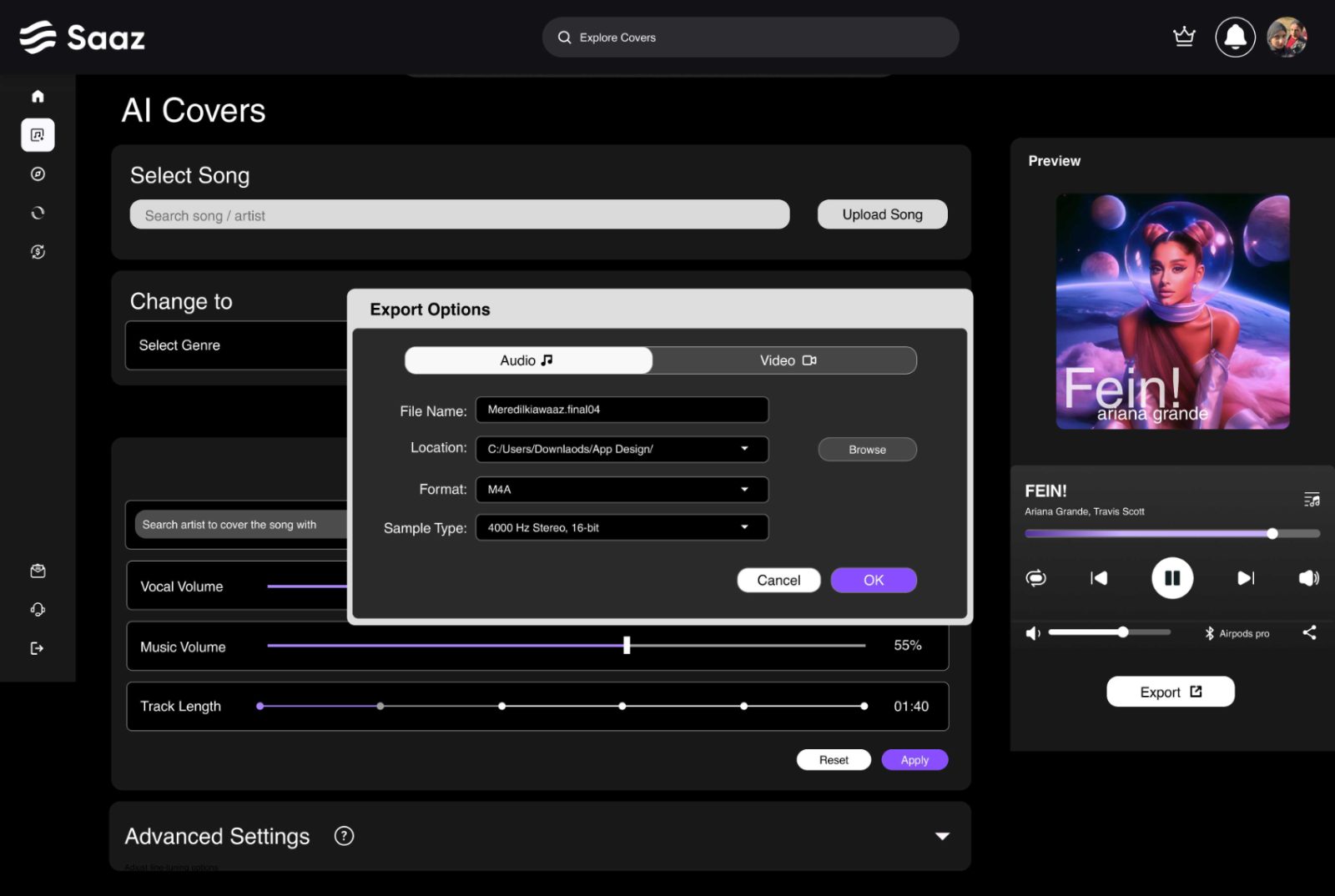
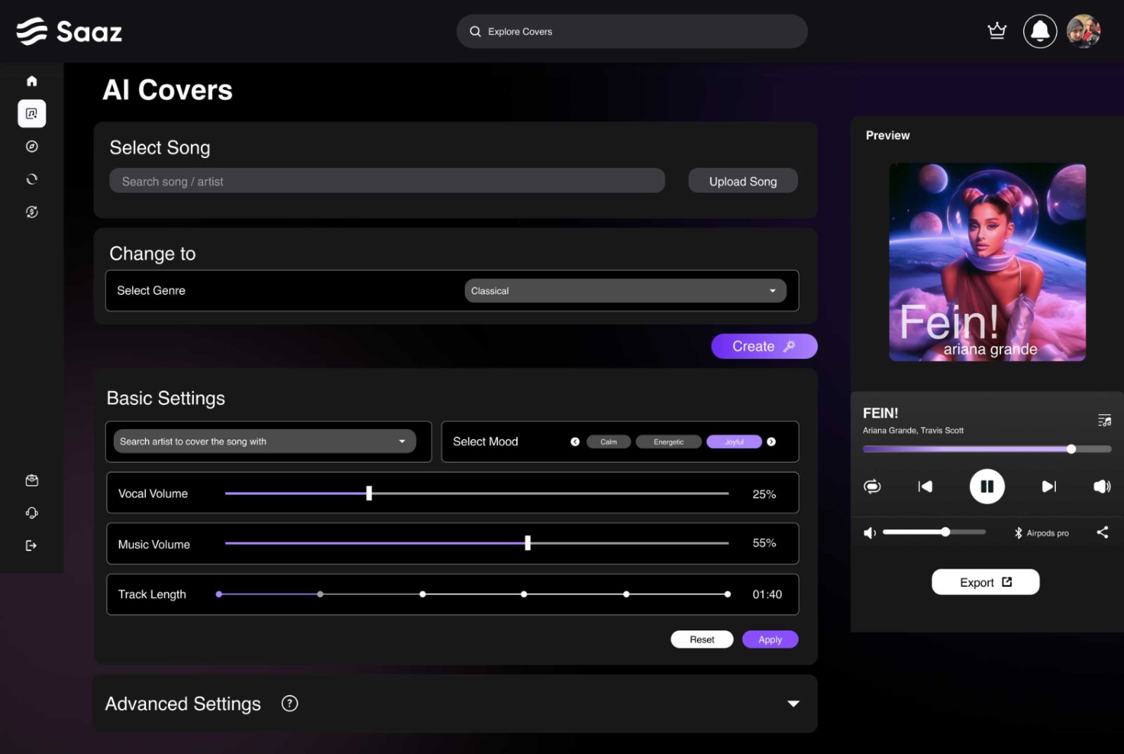 AI Covers, same anatomy, a reference track in place of the prompt
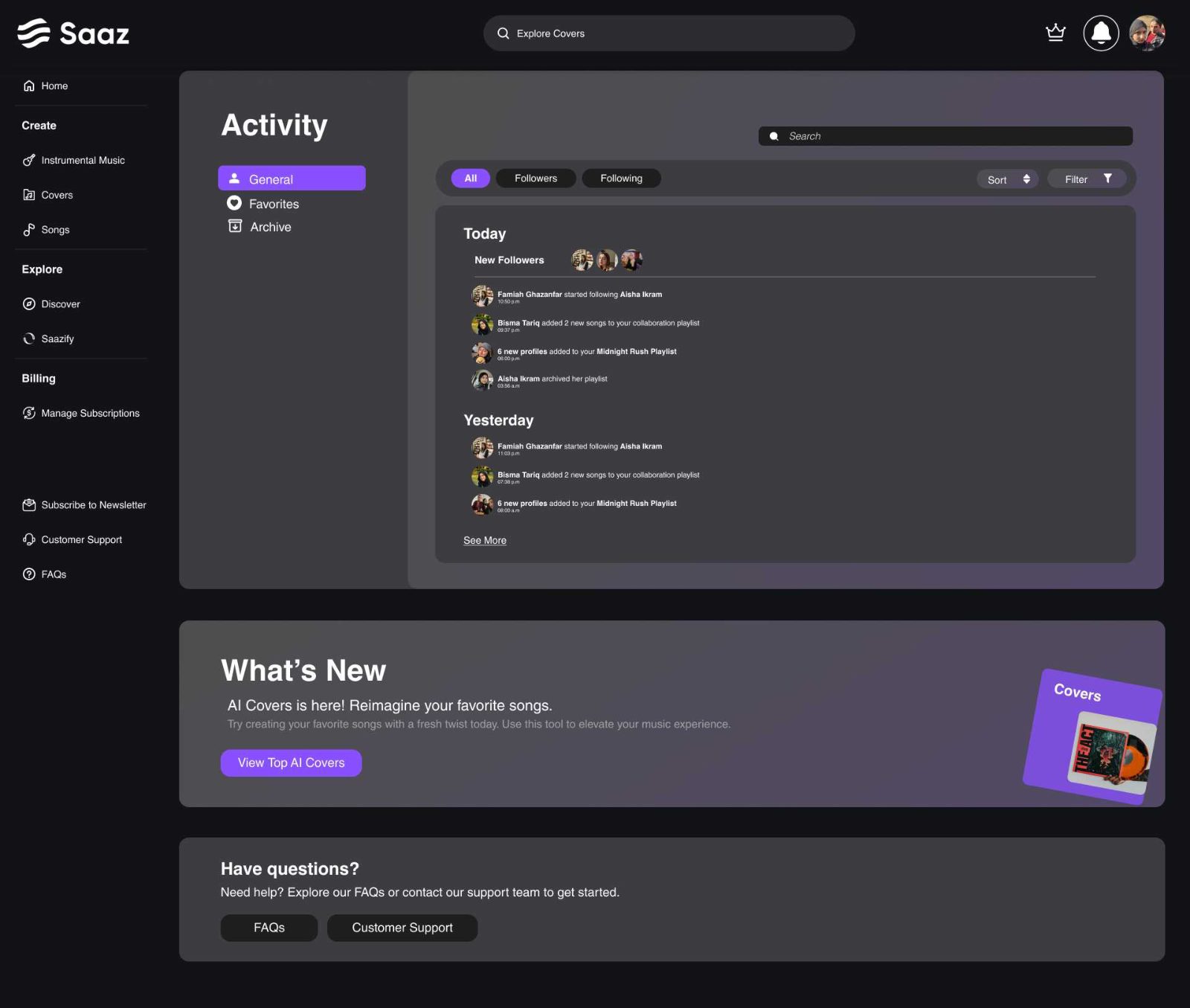 Activity, where a render lives while it processes
The signup wall is where products like this lose people. So the signed-out home is fully browsable and sign-in is a modal, not a page, context is never lost.
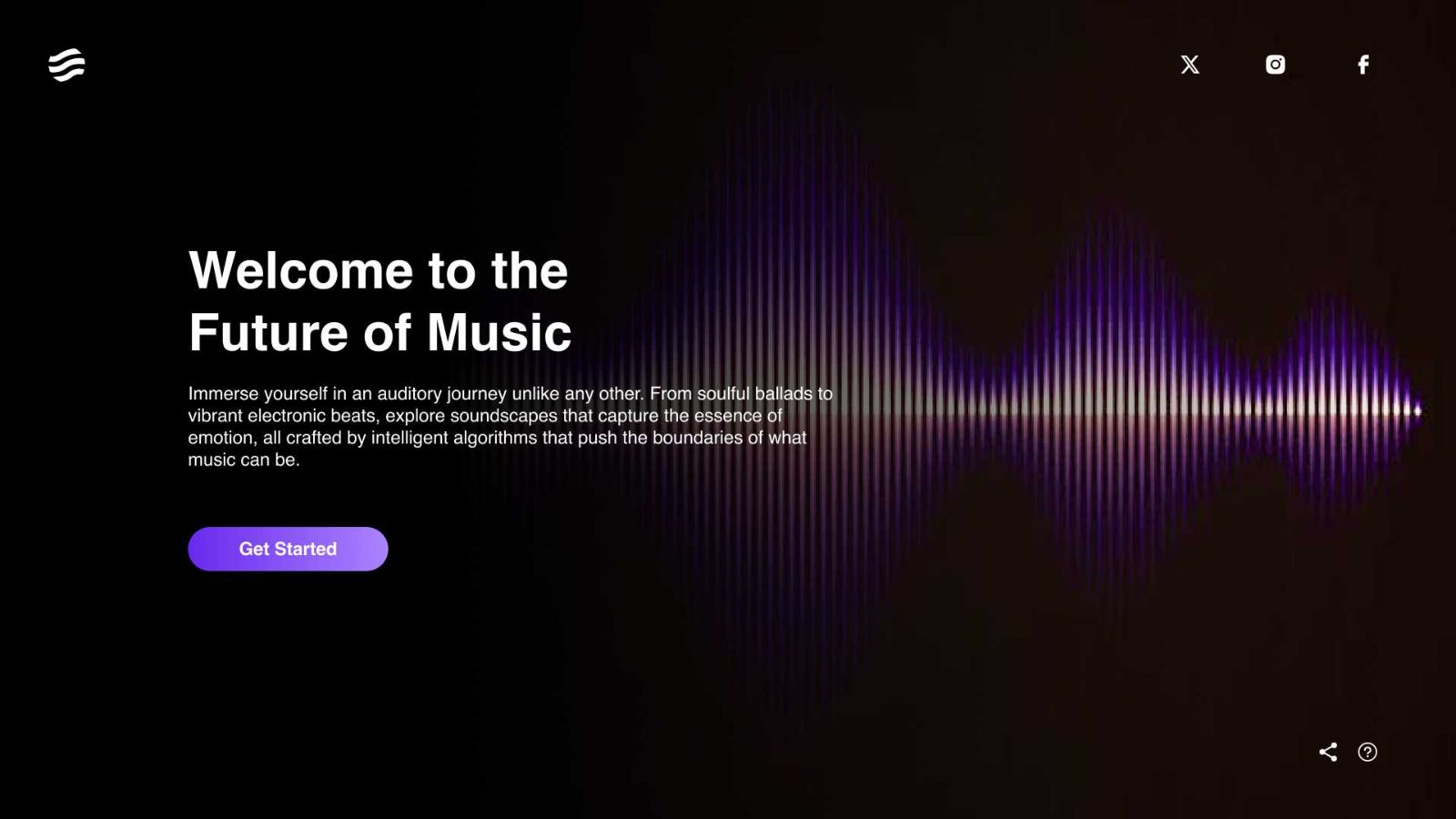 Landing, one waveform, one promise, one button
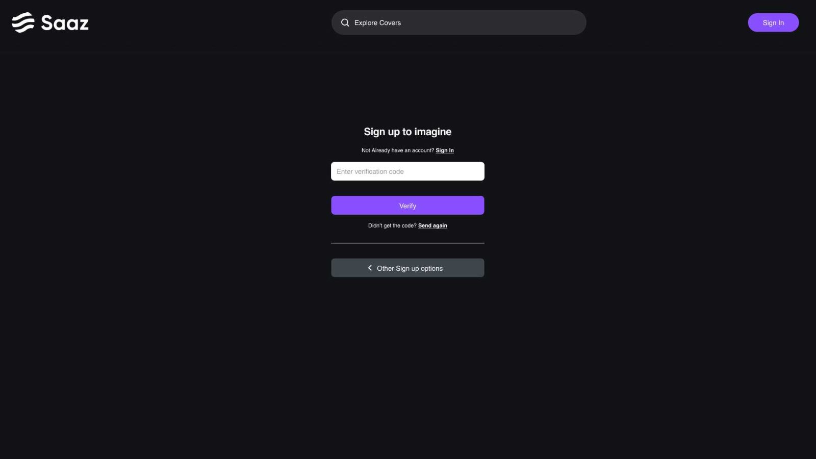 Sign in, a modal, so nothing you were doing is lost
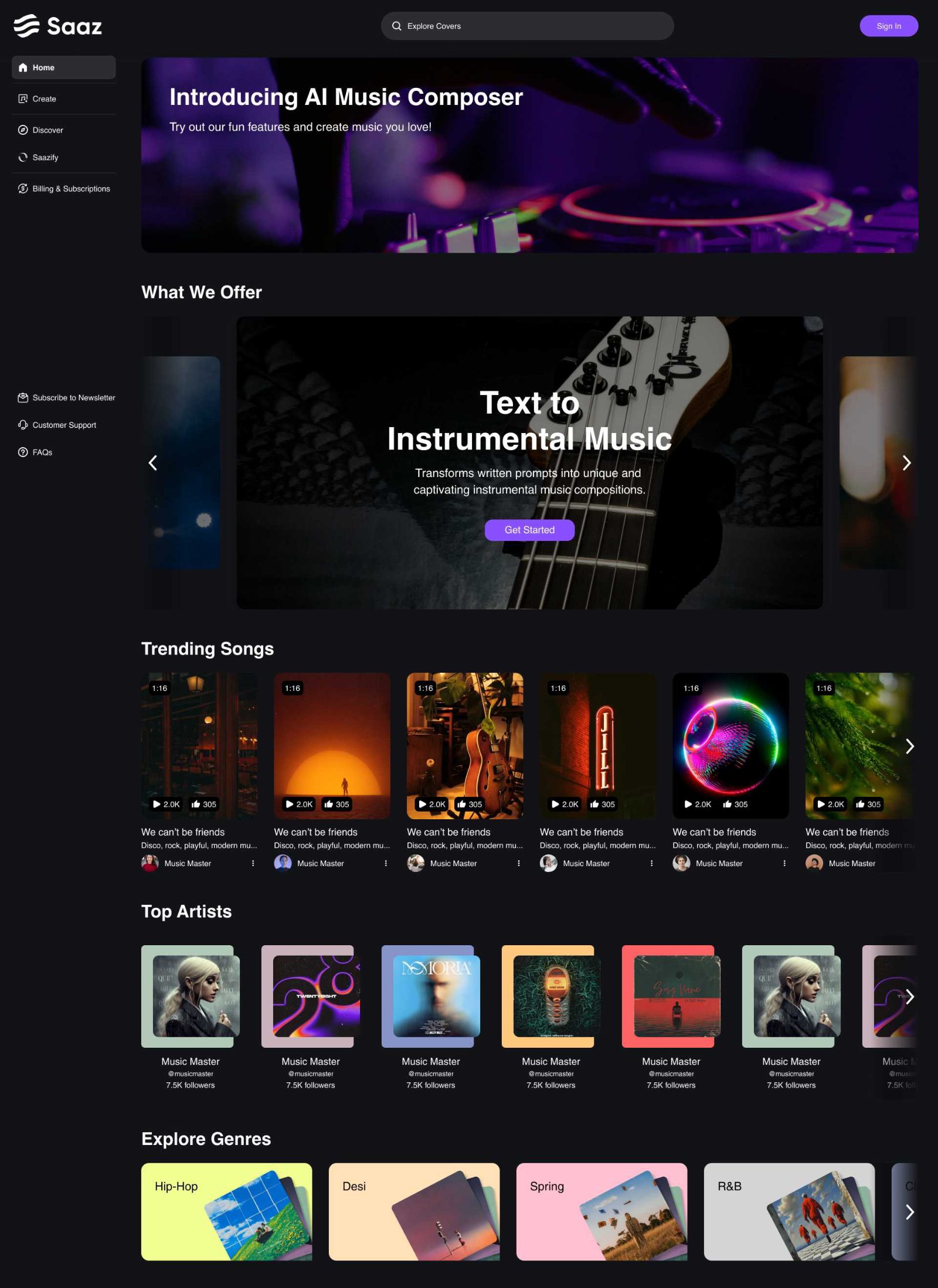 Signed out, the full dashboard, browsable before commitment
A generator alone gives no reason to return. Discover organises other people’s output by genre, and Saazify turns browsing into making, the shortest path from listening to generating.
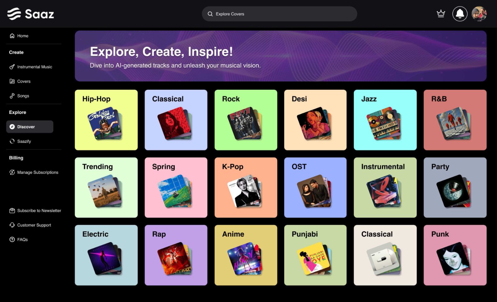 Discover, genres as a wall of colour, no wrong entry point
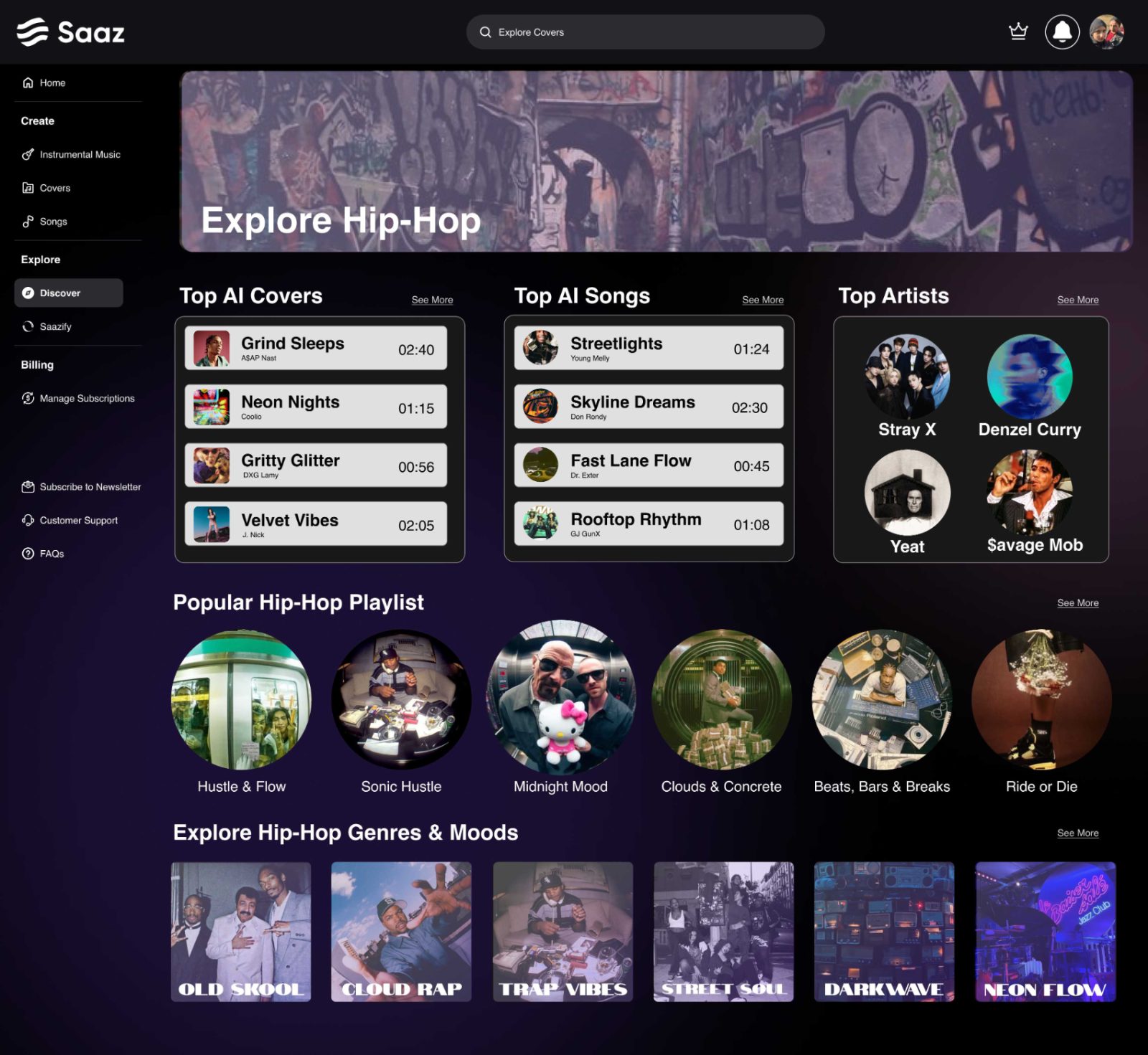 Inside a genre, covers, songs and artists, each a starting point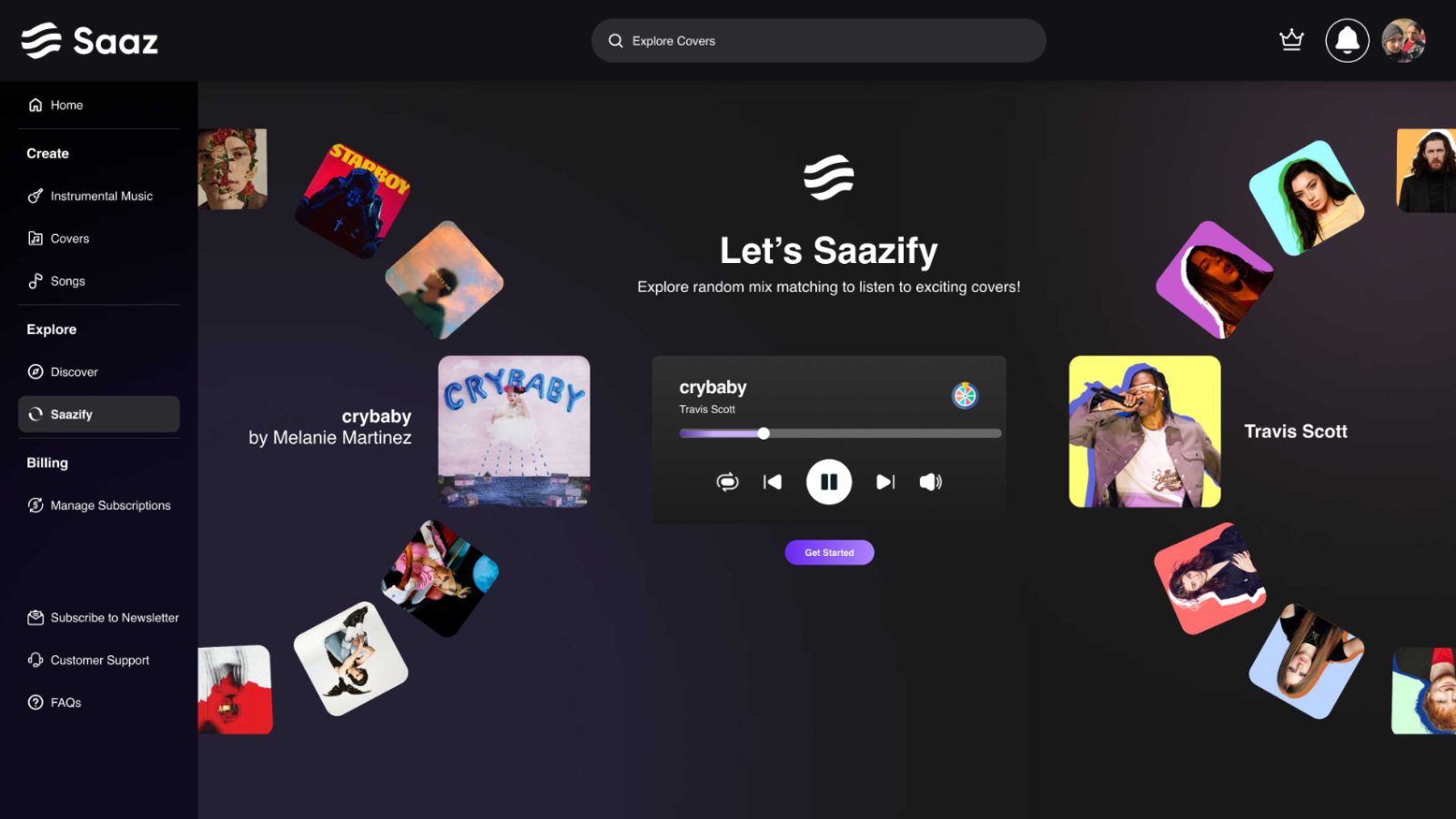
Pick two tracks off Discover and Saazify blends them into something new, no prompt box, no settings. It is the shortest distance between listening and generating, and the reason Discover exists as part of the product instead of a standalone library.
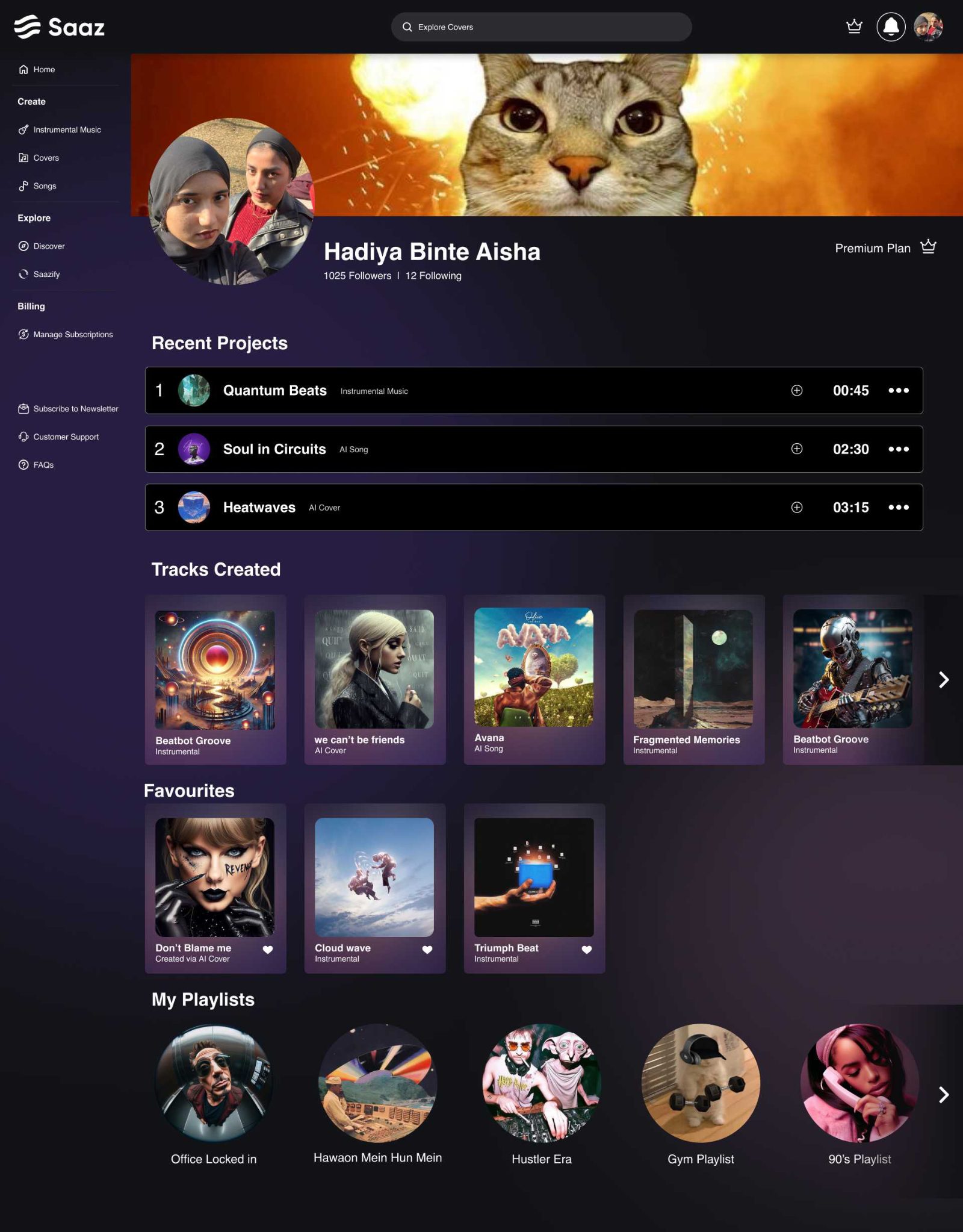
Recent projects, every track created, favourites and playlists, all on one page. It gives a producer a reason to open the app on a day they have nothing new to generate.
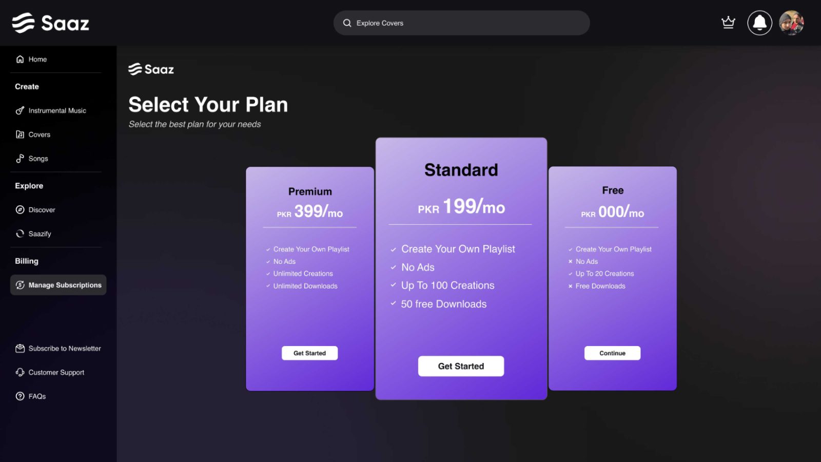 Plans, three tiers, the middle one carried
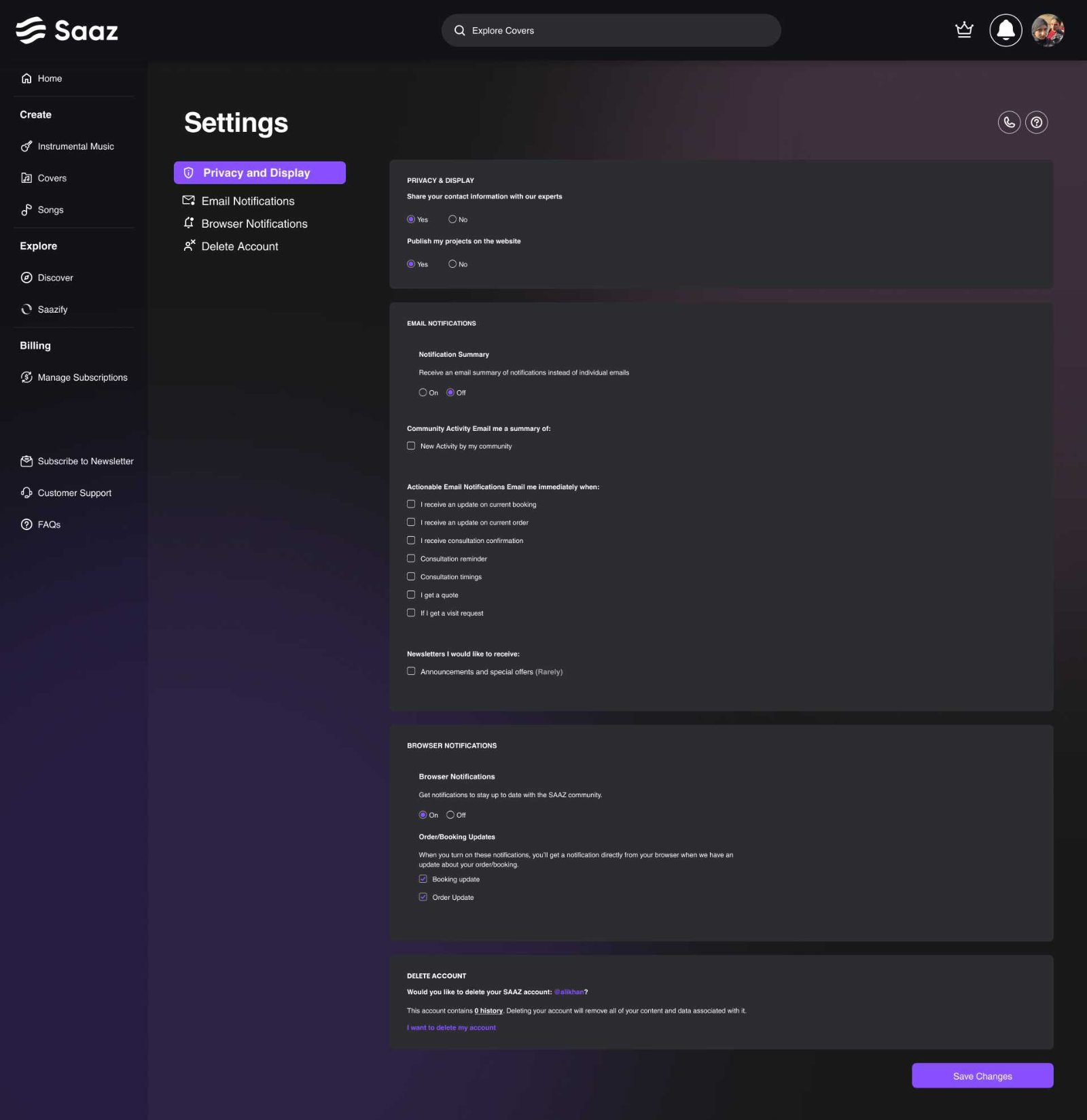 Settings, one column, plain language
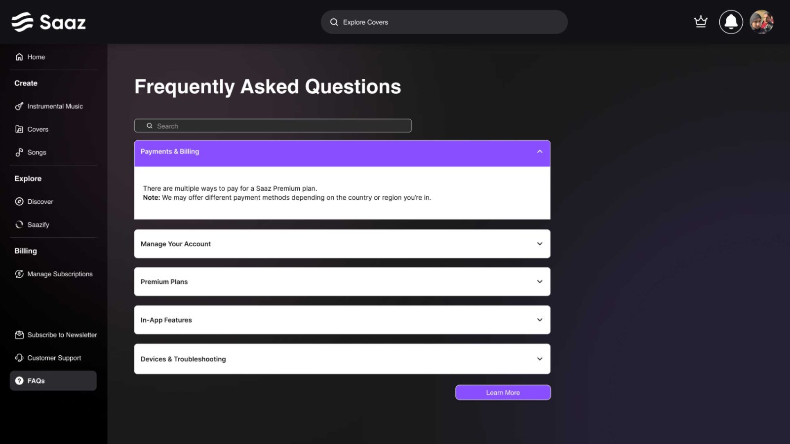 FAQs, the questions usability testing kept raising
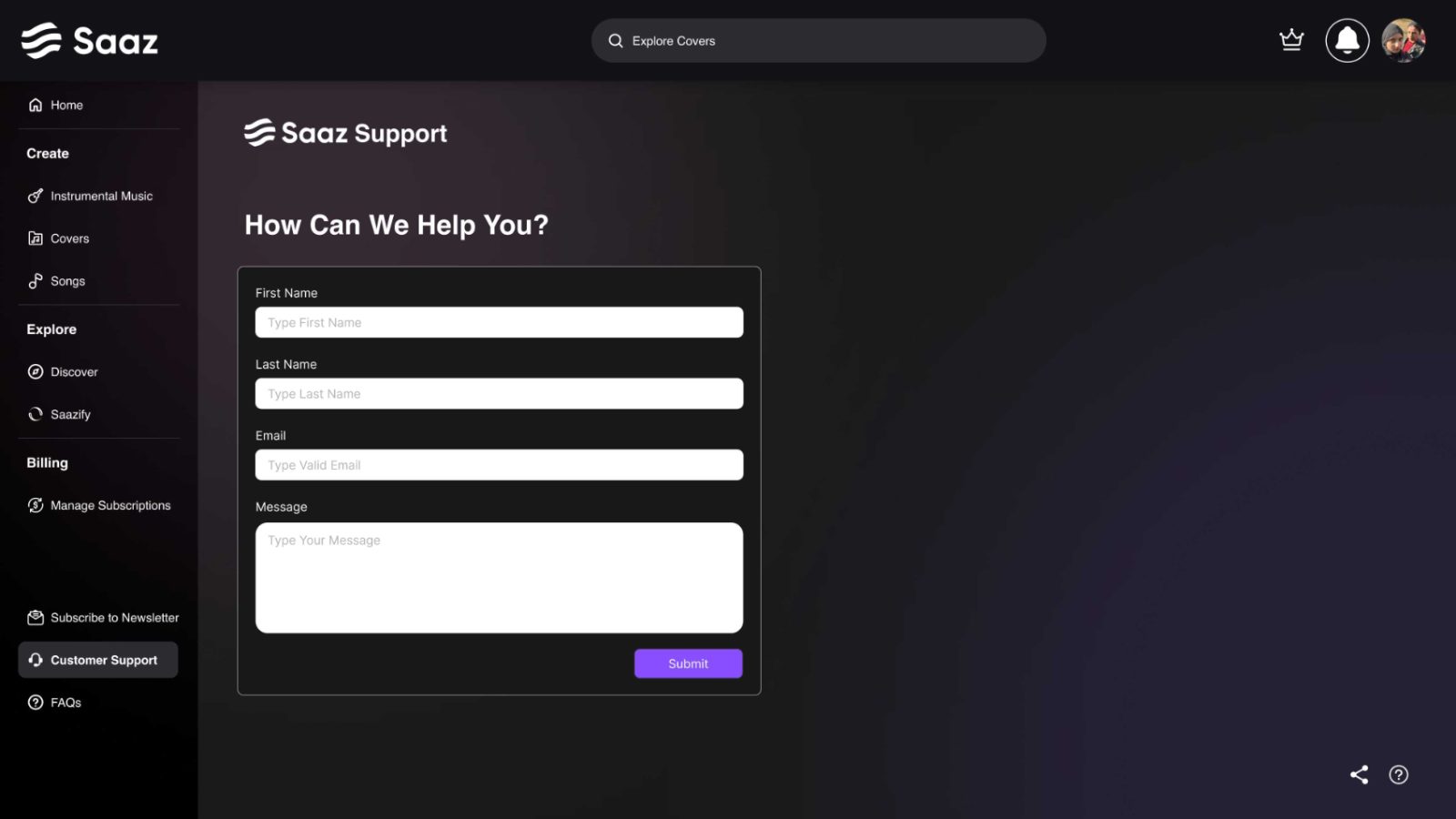 Support, for the ones it didn’t
Saaz sits inside ImagineArt’s brand, so type and palette were given. What we decided was how to spend them: a near-black ground so album art carries the colour, and violet reserved for the generate action alone.
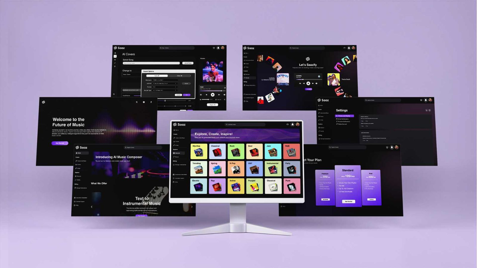 The same system across desktop, tablet and phone, the rail collapses, the anatomy does not
I would defend the shared tool anatomy again. The least visible decision in the project, and the one that made a fifth generator cost a page instead of a redesign.
I would redo the wait. Generation is the slowest moment in the product and deserved its own loading state, not a spinner.
Next: usability testing on the drawer threshold. Where the basic/advanced line sits is judgement, and it should be settled with users.